RuPaul's Drag Race: Season 9, Episode 14
Good TV
Okay, so this has been a weird season. I thought it started off really strong with the Gaga episode, but then the next few episodes suffered from too many familiar challenges and repeat runways. There was a ton of talent among these queens, but I heard a lot of complaints that something was missing. Maybe the queens were too friendly with each other, or at least playing nice on TV... with some obvious exceptions. Maybe in its 9th season, Drag Race was just losing momentum, or maybe they had run out of tricks?
But then there was last week's fiery Reunion episode, and then... then Friday happened. After a somewhat predictable season, who would have guessed that we would get such an unforgettable finale?
But was it fair?
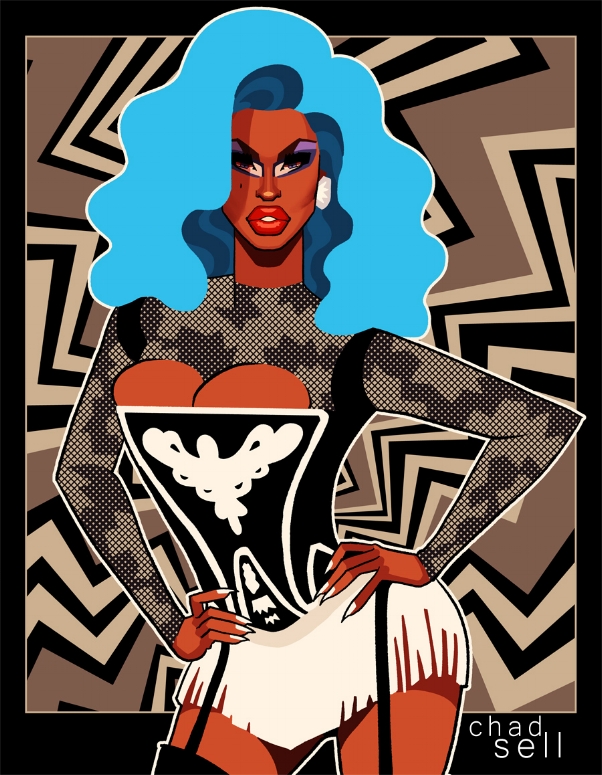
I've been seeing a lot of criticisms that each queen's tally of wins throughout the season didn't count for anything in actually winning the crown. Which... seems legitimate. But maybe it doesn't make for good TV. For example, when Shea won SO MANY challenges, and fans expect that she deserves the crown entirely because of that, where's the drama or suspense when Ru announces the winner? I don't blame Ru for mixing things up, keeping us (and the queens) on our toes.
One might disagree with Ru's judgment about who won each lip sync, but the overall structure doesn't seem fundamentally unfair. For better or worse, the entire competitive nature of this show is based entirely on the whims of Ru -- she's the one who awarded each queen their wins week by week, so if she doesn't want to account for those in making her final decision, that's also her choice. She wanted to see her queens compete for the crown, and she wanted to see them earn it.
Trinity vs. Peppermint
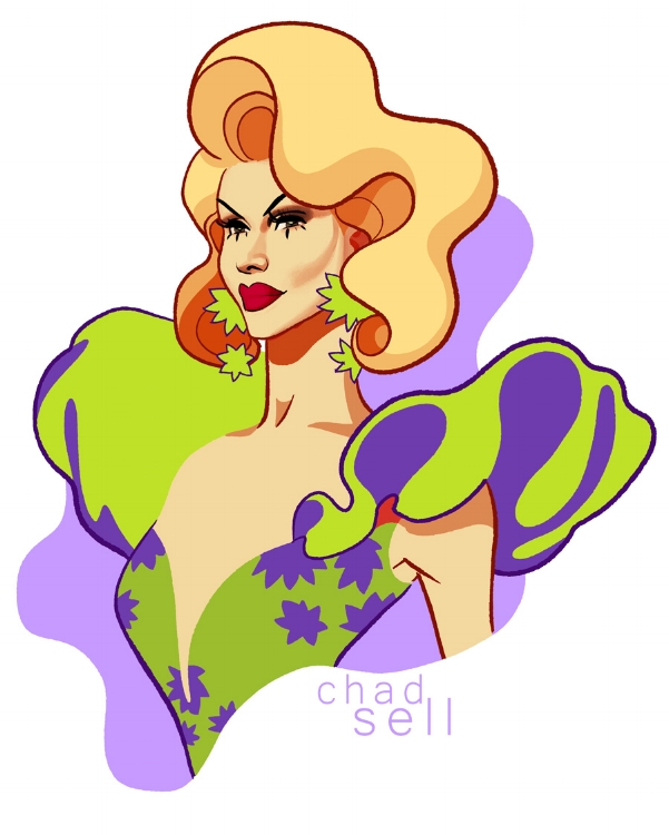
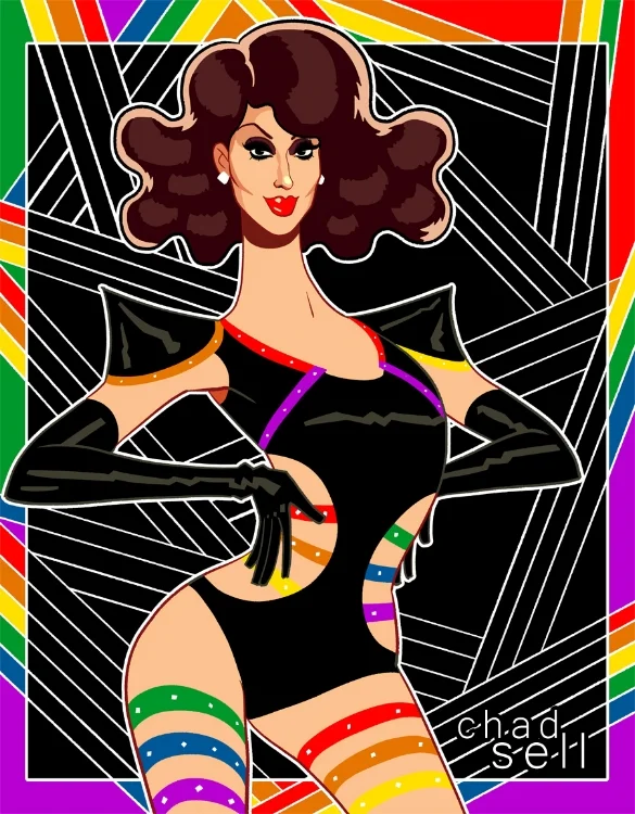
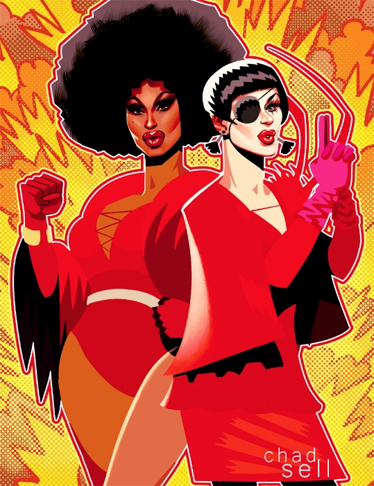
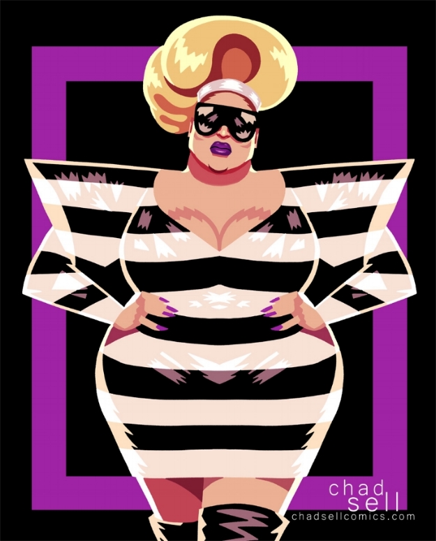
Trinity is a pro. She gave a solid, sexy, tight lip sync. But... it was probably too predictable. Although Peppermint's performance was more subdued, that swirling costume and wig reveal stole the show, and it seems like that's the kind of gag-worthy moment Ru was looking for. Was it a stunt? Sure, but it's that kind of oh-my-god-did-you-just-see-that moment that makes live performance so magical and amazing. If Drag Race has another lip sync battle finale, should we expect to see increasingly elaborate costume changes and gimmicks? Yup, probably. Which will be fun and amazing, until it isn't.
Shea vs. Sasha
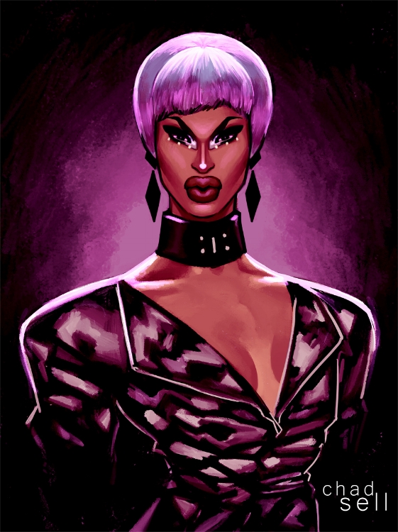
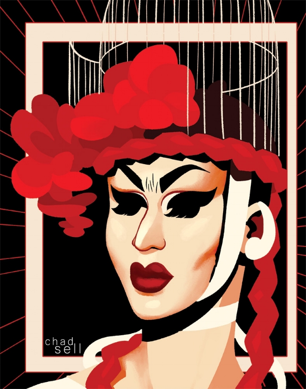
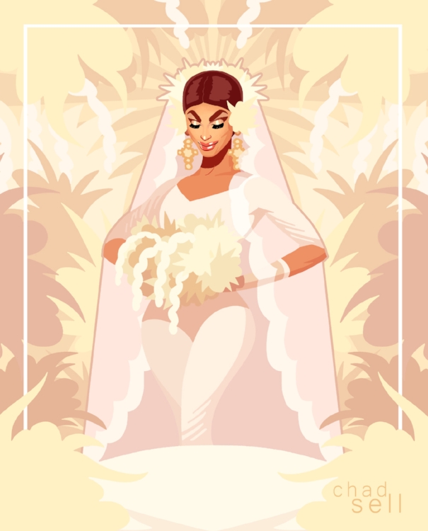
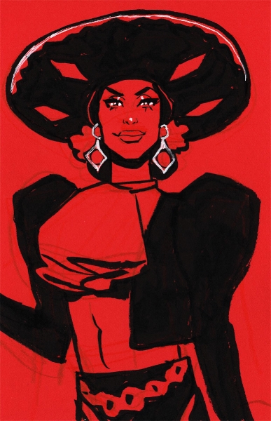
Again, Shea served up a totally tight, professional performance... and Sasha served up something else entirely. Who would have guessed that some rose petals and a wig reveal would give us one of the most searingly gorgeous, unexpected moments in Drag Race herstory? I'm sure it didn't work on everyone, but I can't stop thinking about it. And I've seen that same sentiment all over my social media feeds.
Yes, Sasha is a cerebral, arty queen. But she's also an incredibly emotional performer. And in her most effective performances, she uses that artistry to complement the emotional intensity of the moment. I think there's some kind of amazing emotional alchemy in the way she uses the element of surprise to amplify our own emotional responses to her performance -- as if the surprise of seeing something surreal and unexpected serves to magnify everything else we're feeling. I don't know -- I'm just trying to figure out why her performance seared itself into my soul.
Sasha vs. Peppermint
As fans of drag, how could we expect anything better than seeing these two queens perform with each other?
One of my favorite aspects of All Stars Season 2 was seeing the winning queens lip sync against each other every week -- it was so great to see them on the top of their game, exulting in their victory rather than desperately trying to keep their spot. That's what I saw with Peppermint and Sasha -- two incredible queens showing us what they can do.
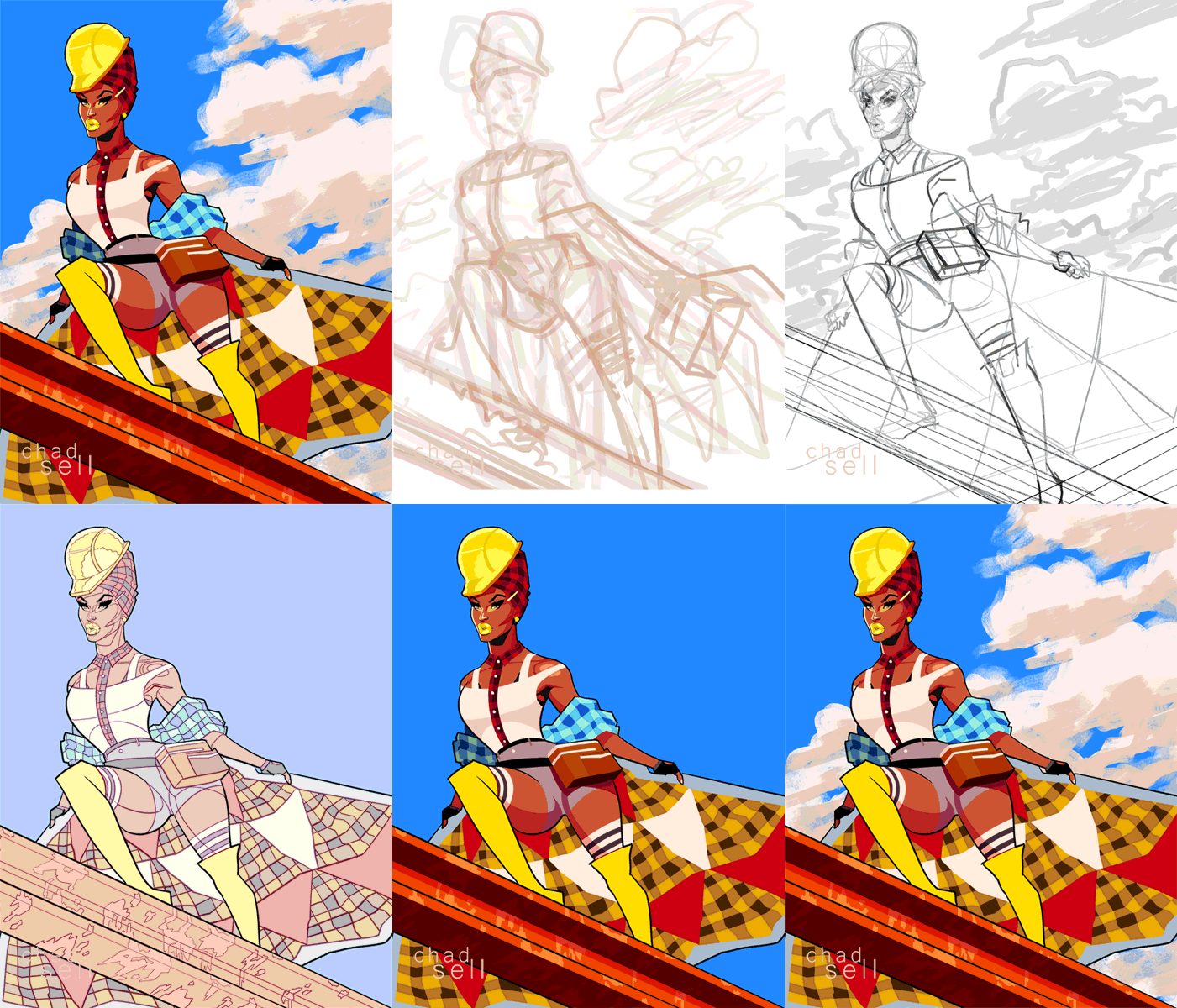
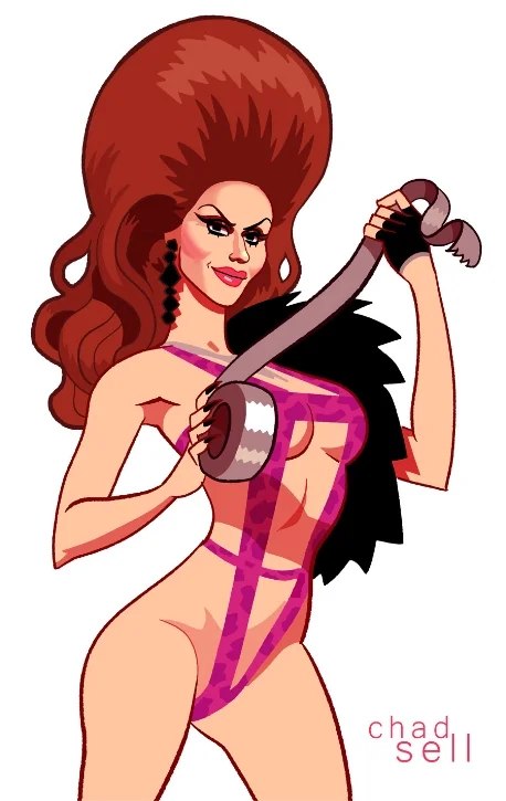
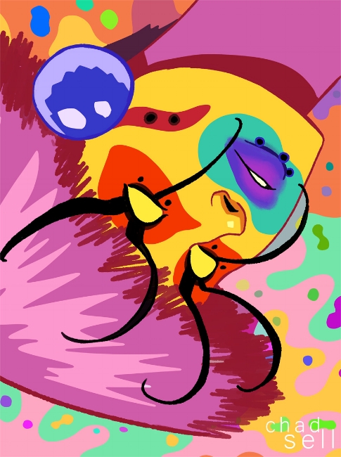
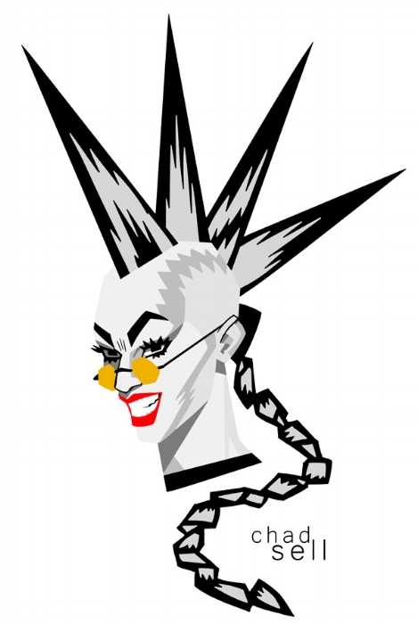
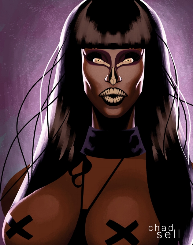
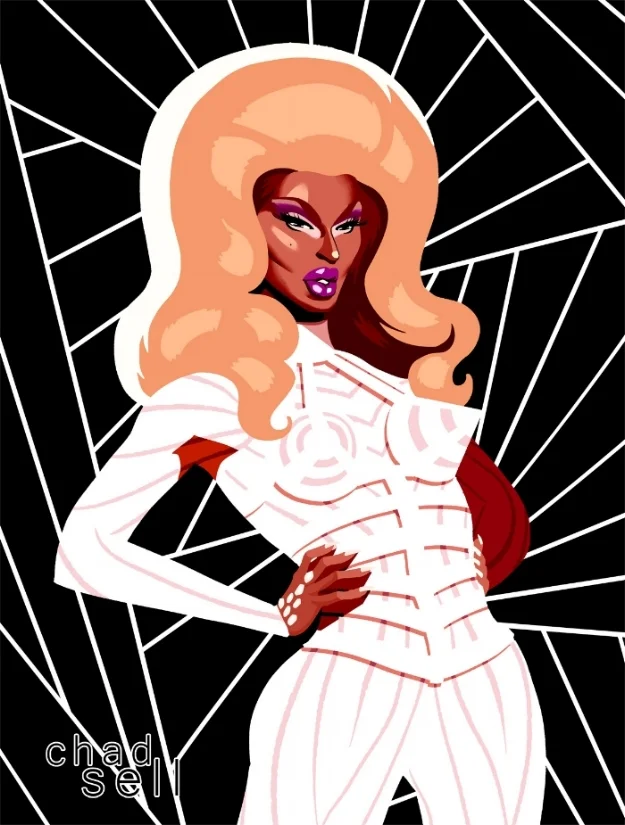
Peppermint was stunning, and much more engaging than in her first lip sync. And frankly, I loved drawing those feathers.
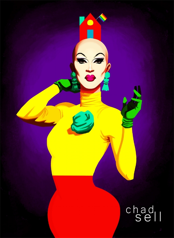
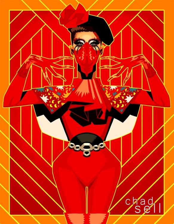
Earlier, I was trying to fumble my way through an explanation of how Sasha uses surreal, surprising imagery to bring out the emotional intensity of her performances. And I think she does something similar with her aesthetics -- she uses sharp to accentuate the soft, with her intense brows, bald head, and alien facemask serving to enhance, not detract from, her beauty.
Although people seem to have responded most strongly to Sasha's wig reveal from her first lip sync, I thought this one was a stunner, too. I mean, the MASK, breaking off the pieces of it -- it all worked so perfectly, and I couldn't keep my eyes off her for the rest of the performance.
Yes, I'm excited that she won. Shea is an amazing queen, (here are three brand new music videos if you need any additional evidence) and I would have loved to see her take the crown. But after never quite stealing the spotlight throughout the season, it was amazing to finally see Sasha shine.
Season 10
Honestly, after such a long, mixed season, I was amazed and excited by this finale. It shows that Ru isn't afraid to shake things up, to both challenge her queens and to showcase their strengths.
I would love another final challenge like this for Season 10, but... maybe broadcast live? It would be tough for the queens to change their costumes between performances, so maybe it would need to be a 2 hour show with some filler in between -- perhaps that's where we would get the reunion interviews with the other queens? Maybe the reigning queen from last season could come out and perform? My only complaint about this year's finale was that there were so many spoilers online (which I was admittedly excited to read), and I don't see any way of avoiding leaks except for broadcasting it live, or... not performing in front of a live audience.
Thank you.
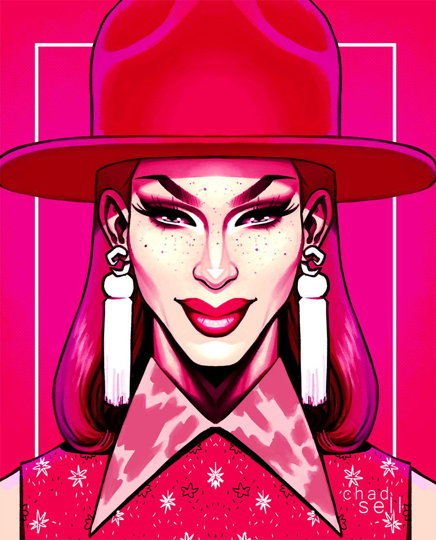
Seriously, thanks for reading my random Drag Race thoughts throughout the season! I hope I've been able to offer some good interviews and observations about the show, alongside some pretty art.
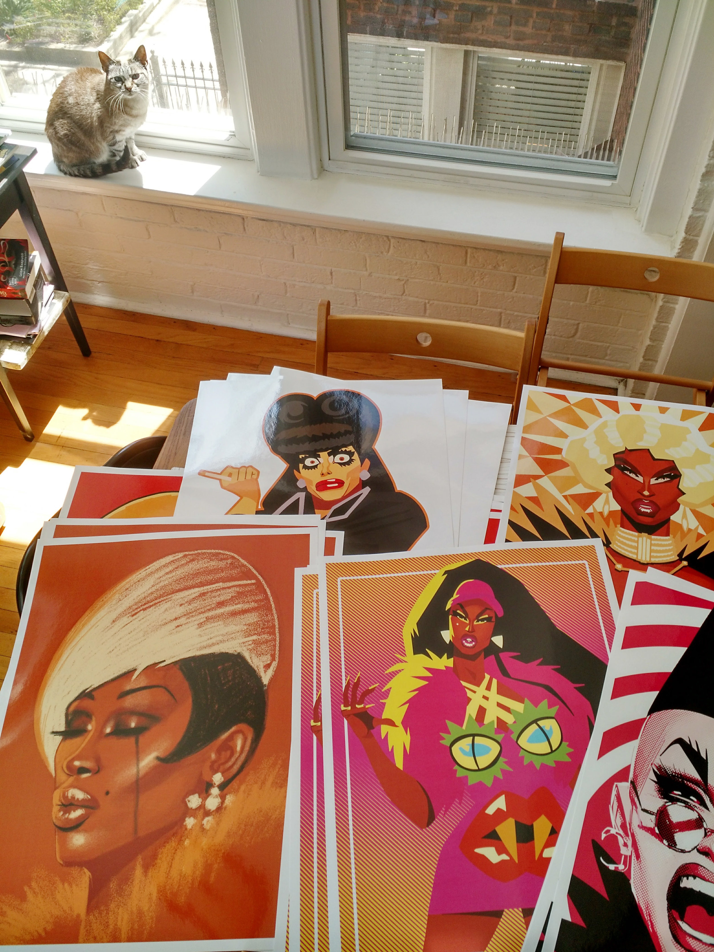
If you'd like to support my work and help me make more in the future, you can buy prints, books, and postcards on my Etsy store or sign up to directly support me on Patreon! That's a site where you can give your favorite artists a few dollars a month to get cool exclusive stuff and peeks behind the scenes!
Every season, I collect all my best artwork into fun little books, and you can pre-order 90 QUEENS, my season 9 collection, right now!
Oh, and if you need more Sasha in your life, read this interview I did with her during last year's ALL STARS!

