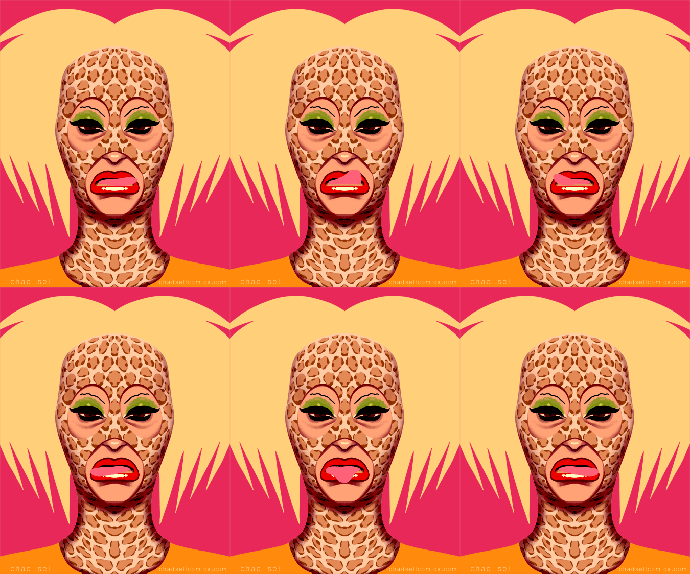
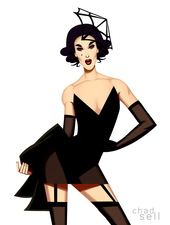
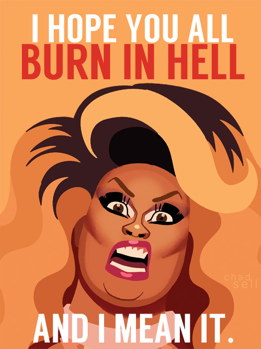
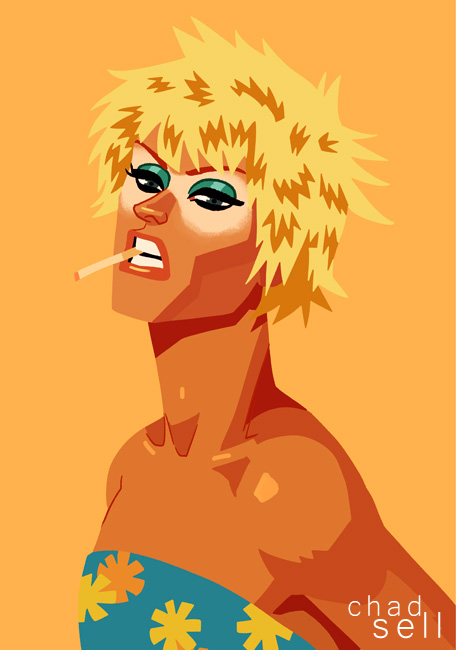
COLORING WITH QUEENS

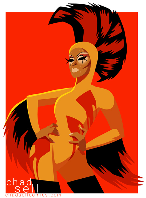
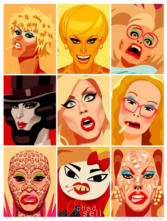
coloring-logodownload-linkC'mon Season 8! Let's get COLORING! That's right, I'm having a COLORING CONTEST to celebrate the start of RuPaul's Drag Race, Season 8! I'll pick winners from multiple categories who will receive DUMB DRAG GRAB BAGS full of stupid stuff.

Click here to download the high-quality files to get started! Share them on Instagram, Tumblr, or Twitter and tag them with #coloringwithqueens by 5pm (Central Time Zone) Thursday, February 25th to enter!

HE-RA: Masters of the Everything

Tongue I had a major revelation on Thanksgiving. While rooting through an old closet at my parents' house, I dug up my old HE-MAN toys. And I realized, "Wow, these are everything."

It's fair to say that HE-MAN has had a major impact on my artistic inclinations throughout my career.

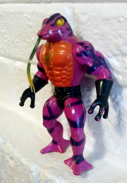
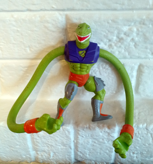
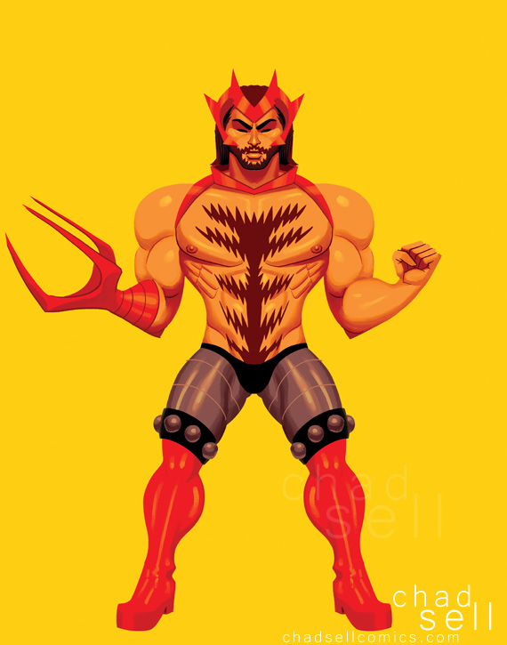
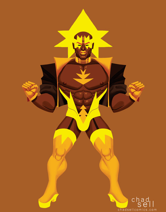
The original line of HE-MAN figures all shared the same ridiculously muscular torso and weirdly small, bow-legged feet. The heroes all had absurd, homoerotic harnesses and skimpy armor, but I was obsessed with the villains. They're the beastly ones with freakish tongues and appendages, but with that same delicious torso.

Snake-guy

(I have no idea what this guy's actual name is, but I call him Randy Reacharound.)

I loved the bizarre variations on the same basic template, the bold colors, and the utter weirdness of them all. Other toy lines, like Teenage Mutant Ninja Turtles, had their share of fun characters, but HE-MAN always had the greatest hold on me.

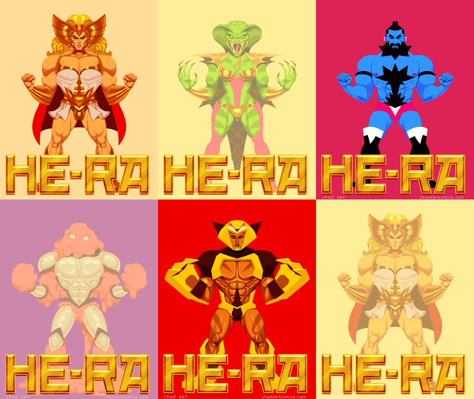
I wanted to create my own character designs, inspired by the original spirit of HE-MAN, but playing more with gender and sexuality. Thus was born HE-RA: Masters of the Everything!

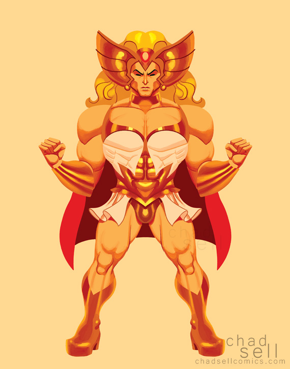
He-ra

Here's the hero HE-RA, who clearly isn't based on any pre-existing characters at all.

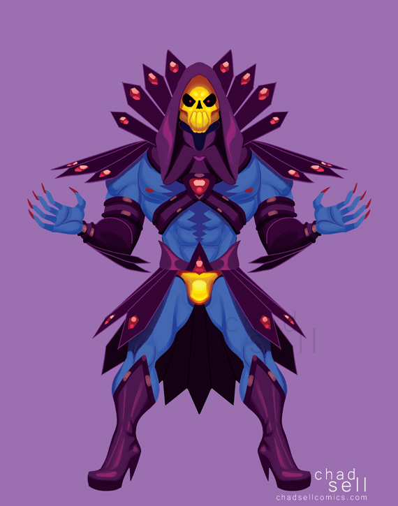
Skelletra

And here's SKELLETRA, the wickedest bitch in the land.

Klor

This is KLOR, HE-RA's greatest rival.

BolttBOLTT, one of my favorites.

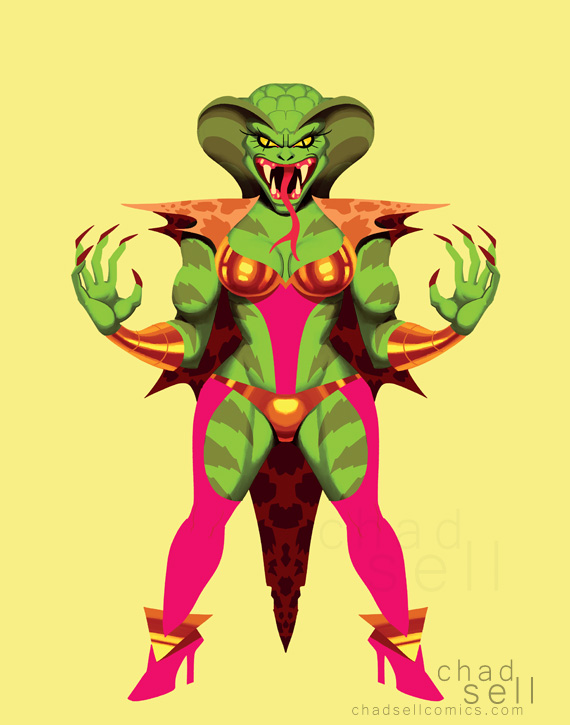
Cobrella

This is COBRELLA, lookin' pretty in pink.

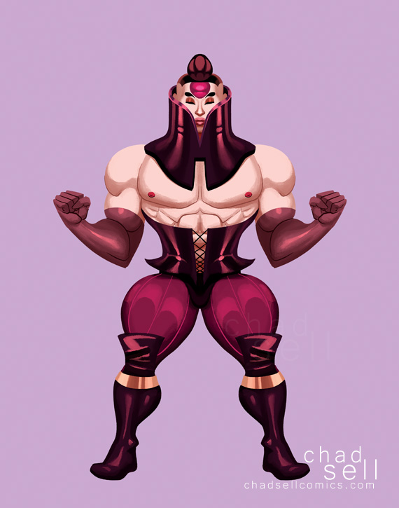
Karol

And.... KAROL.

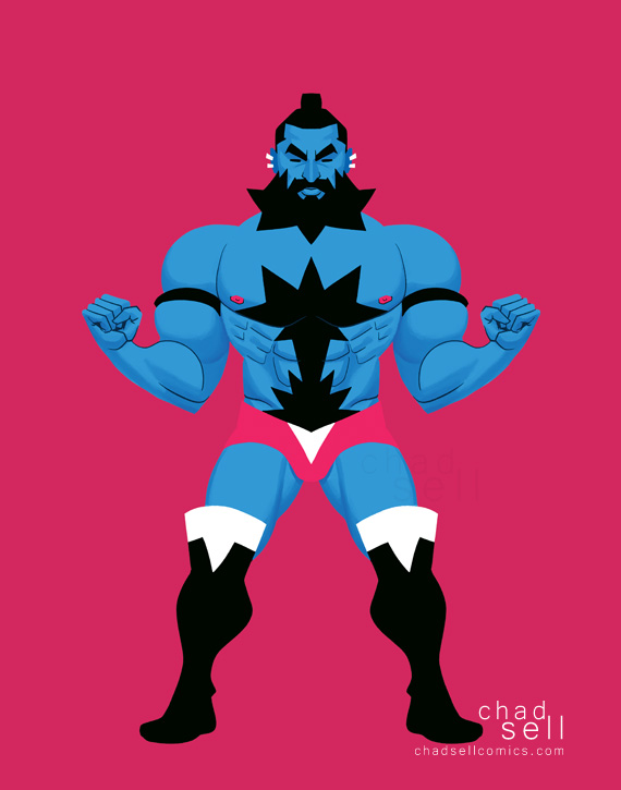
Ziefgang

ZIEFGANG is not intended to bear any resemblance to any sexy bear characters from any videogames whatsoever.

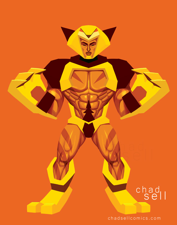
Whiskrz

He is fast, he is deadly, he is... WHISKRZ.

Glorzok

Obviously, I played around with the same basic pose and ridiculous musculature throughout all these, but with GLORZOK, I wanted to show a gloopy, formless character who literally molds himself into shape with his armor.

As you might guess, I have prints of all these lovely creatures available on Etsy!  Just in case you want to add some hunks to your wall.

he-ra-animated2

PATREON TUTORIAL #5: Keeping it Real

As an art student, you can spend countless hours learning to draw models and still lives as realistically as possible, mastering the subtleties of shading, form, and anatomy. But as a cartoonist, if you try to convey that same level of detail and accuracy in each panel, you'll probably go mad, and you'll miss a lot of what makes cartooning so magical. It's taken me a long time to learn that lesson, and I often need reminders.

Maybe there are times when you need to sink whatever amount of time is necessary into an illustration to show off everything you can do. The cover illustration of your book? Sure. But as I've developed a career in art and illustration, I've learned the importance of doing more with less. There are deadlines to meet, hours to bill, priorities to make. Do you want to sink more time into fewer pieces, or get a lot done in a simpler style?

comparison

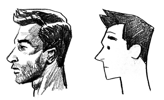
Which of these drawings is better? I don't know, that's a complicated question. But I can tell you that the goofy drawing on the right took me a lot less time, and I like it a lot more.

When I was first diving into my own comics after college, I was trying to make every single page as gorgeous as it could be. But I had a hard time making any progress, because I would keep going back, fixing any perceived mistakes, doubting every step.

A good cartoonist is quick. They develop a set of tools and tricks that get the job done: they're efficient, effective, and they're fun. 

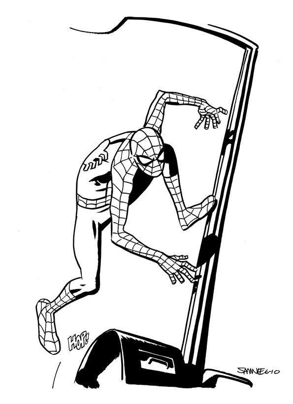
Spideyhop-1One of my very favorite artists working in superhero comics today is Chris Samnee. He manages to capture a sense of solidity and life with minimal details, clever compositions, and simple use of shadow. (Seriously, check out that gorgeous work on the left! He's great.)

All of us develop our own style, one that involves our own ways of simplifying the world – whether it's through playful abstraction of the human body, whimsical linework, or whatever. That's the magic of cartooning!

So what are some ways to simplify?

  • mantadadStop worrying about what looks "real" and concern yourself with what works. 
  • Don't just copy. Or don't ONLY copy from other people's work. You can definitely learn a lot from other artists, but you'll only develop your own distinctive style experimenting on your own!
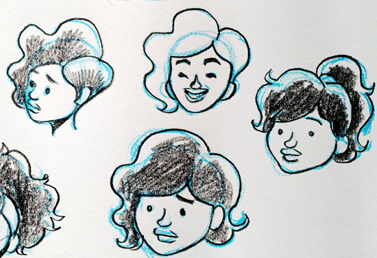
  • Draw small! I love doodling in a tiny sketchbook to keep myself from getting too detailed.
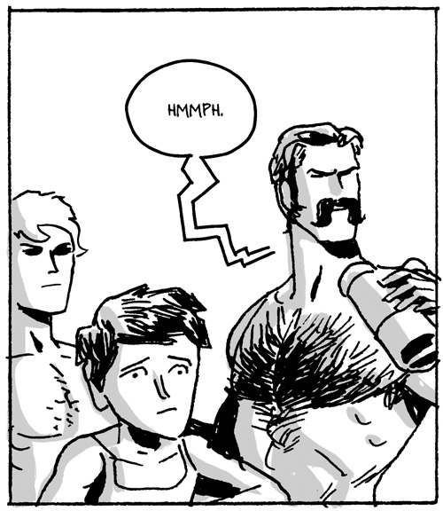
  • Set time limits! When I drew my comic MANTA-DAD, I limited myself to 2 hours a page. It wasn't always pretty, but it got done. Plus, I learned a lot and drew so many hunky men.
  • Give yourself deadlines! I send out dozens of original drawings to my Patreon supporters every month, so I keep them quick, and I keep them fun.
  • Doodle when you're tired and don't care! Weird stuff will happen.
  • If you're working digitally, don't let yourself zoom in past a certain point. And zoom all the way out every few minutes to make sure that the full page looks amazing.
  • chaosIf you're not working digitally, take frequent breaks to step back from your desk and see how it looks from afar.
  • Use the biggest, thickest line you can. Don't get hung up on fine lines, hatching, all that small stuff. Try using thick Sharpies and see what happens.
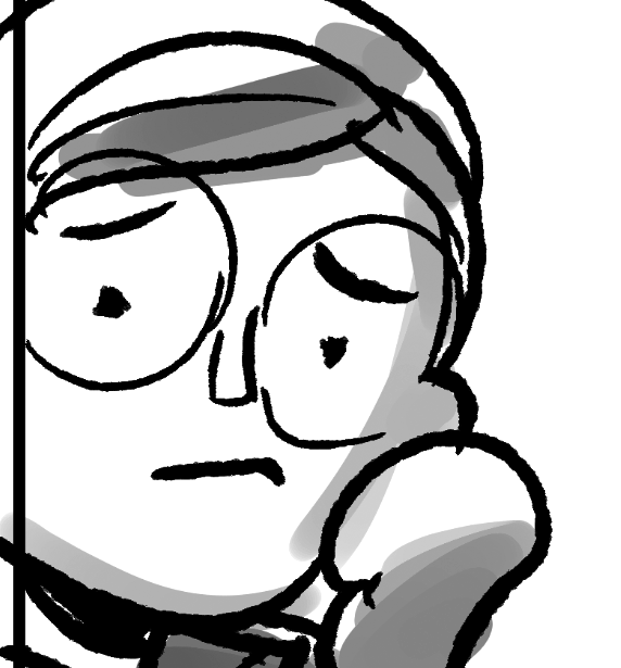
  • Insert some chaos into your process. I like to use a rough, textured drawing tool when working digitally.

-----------------

This post was made possible by my supporters on Patreon! Click here to find out more and support my work!


PATREON TUTORIAL #4: Gettin' Sketchy

Although the vast majority of my work is done digitally, sometimes I need to set aside the screen and draw on some paper. Although digital illustration gives you a tremendous amount of versatility and options for your work, those endless possibilities can prove creatively daunting. With so many tools at hand, I sometimes find myself losing my way – whether that's because I'm on week 10 of my Drag Race season, and I've been drawing the same damn thing for too long, or because I'm struggling to find the right style for an entirely new project. There's a set of tools and techniques I reliably turn to when I need to relax, loosen up, and let the ink fly.

sketching-stuff-1

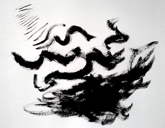
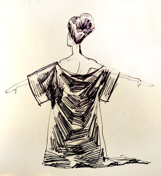
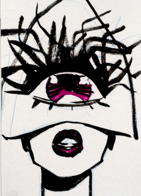
My favorite tool for doodling lately has been my trusty old Pentel Brush Pen. It has enormous brush bristles, so it provides an extreme variety of line widths. And the dry brushing! Oh, such TEXTURE! You can squeeze the handle to send more ink into the brush, but sometimes it pays to exploit the gorgeous textural stuff that the Pentel provides as it's going dry.strokes

The Pentel is one of the most popular brush pens around, and it's also quite affordable. You'll probably see it at a fair number of art supply stores, and you can find them and their refills online. The one I use is probably about 10 years old, and it's still serving up its delicious, thick inks.

woman1b

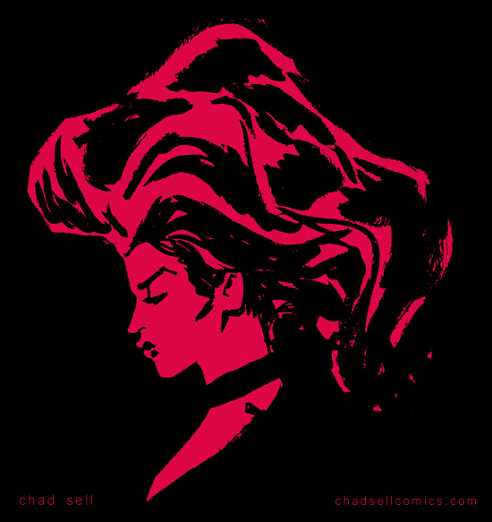
I should warn you of a few peculiarities about the Pentel. The extreme variation of line width it offers also makes it difficult to be too precise or delicate with your linework. That can prove frustrating until you learn to embrace the Pentel's extremes and utilize that unpredictability to loosen yourself up.

Also, the ink is weird. Like, you'll find yourself smudging it and making a mess unless you learn to leave it alone until you're absolutely sure it's dry and will behave. The ink is water soluble*, so don't plan on using any ink washes or watercolors with it, unless you want things to get very runny. (*In my previous tests, the ink was water soluble, but apparently some refills are not? So, you should check for yourself!) I use Copic markers extensively with my Pentel doodles and don't have any problems.

postcards2

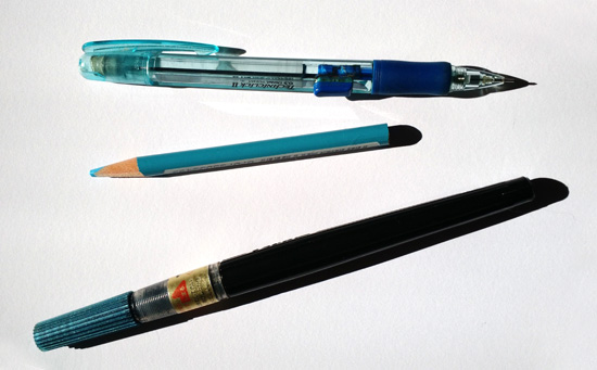
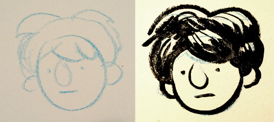
You might have a lot of fun just going to town with the Pentel and some paper, but I prefer to lay out rough sketches before inking up a page. My favorite tool for that sketching phase is the Prismacolor non-photo blue pencil.

blue-pencil

If you've ever stepped into an art supply store, you know that Prismacolor pencils are expensive. But they're also extraordinary. Their leads are soft and buttery, which is great for big, loose sketching that suits the linework you'll ink later with the Pentel.

pen leads

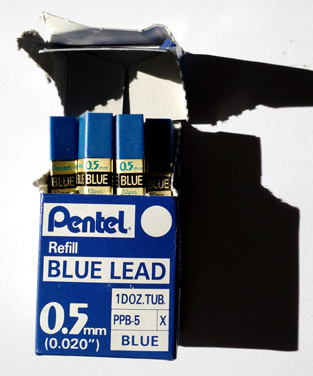
Alternatively, I also really love using non-photo blue leads in a mechanical pencil holder. You might not have realized it, but you can buy replacements leads for mechanical pencils at high quantities for low prices. And better yet, you can buy them in different colors or densities, just so long as you make sure the lead width matches the pencil holder you're putting them in! I use these Pentel non-photo blue leads, which offer a very delicate, precise line.

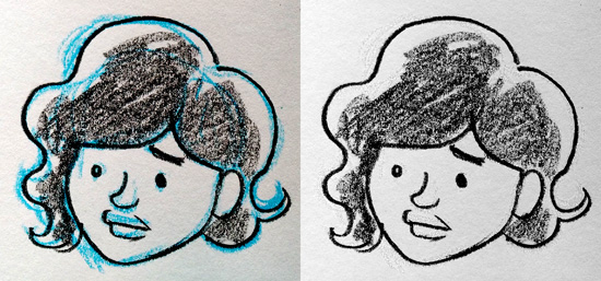
If you're wondering what “non-photo blue” pencils are, they're a holdover from old school design techniques. This particular shade of blue is designed so that it doesn't show up in black and white photography or old Xeroxes. Which sounds like a super cool magic trick, except that it will absolutely show up in your digital photos or scans. However! This color, because it's light and bright, is easy to Photoshop out of your work. There are a number of methods that will work, but I go to the “channels” section of Photoshop, select the Blue one, then copy and paste it into a new document! That should largely get rid of the blue sketch underneath your inked art, and then using some level adjustment will get rid of the rest!

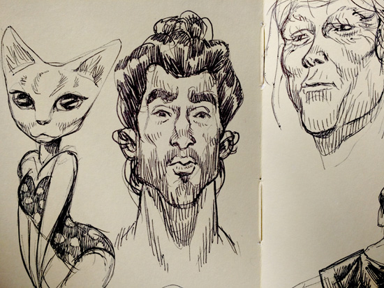
blue-lines pen-sketches2 In the spirit of loosening yourself up, sometimes keeping things tiny will help, too. I really enjoy sketching in my tiny Moleskine book, because the little pages will keep you from getting too precious or detailed with your work. I find myself using a simple Bic pen in my Moleskine, because I can get incredibly delicate lines that work perfectly at that small size.

pen-sketches3

When sketching in a larger sketchbook, I find myself using either the Pentel or an Ebony pencil. I find that the Ebony gives me a soft, chunky line that's perfect when I'm doing character designs for The Cardboard Kingdom, the giant new comics project I've been working on the past few months!

ebony-sketches

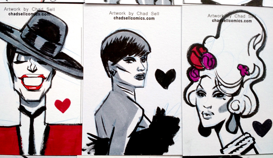
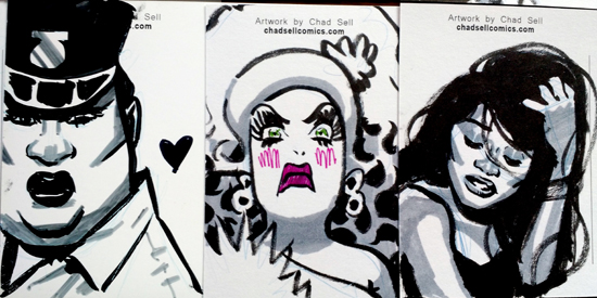
postcard3I really look forward to my monthly postcard sketches for my Patreon supporters, because they're fun little doodles where I can experiment and let the weirdness flow. Like I said, I use Copic markers for these, specifically different gray tones that work well for shading. They don't seem to mess up the Pentel ink, and they add a great sense of solidity to the final work. I should note that I avoid Prismacolor markers, because their fumes give me massive headaches. Copics smell a bit, but they don't seem to have the same effect on my poor brain.

I hope some of these pointers have proven useful! Let me know if you have any questions about the materials or techniques! My monthly tutorials and process peeks are made possible by my amazing supporters on PATREON!

postcards1


PATREON TUTORIAL #3 (For Patreon supporters only!)

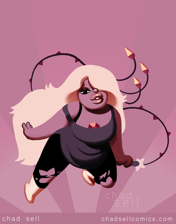
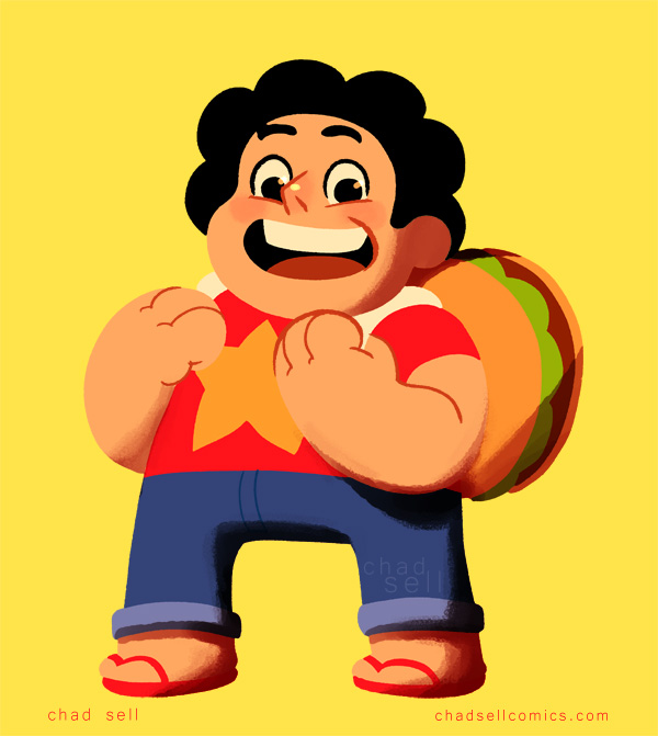
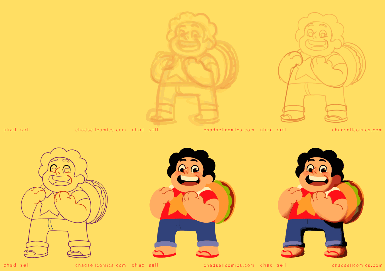
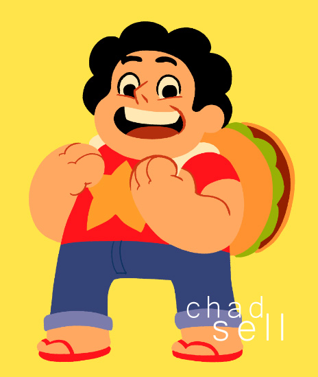
steven All this month, I've been busy drawing the “doodle drafts” for my Cardboard Kingdom comics, so I don't have much new art to share with you that wouldn't spoil the fun! However, I recently started watching Steven Universe (thanks to a new Hulu+ subscription) and I'm totally loving it! I had heard the rave reviews, and I had caught a random episode here and there, but it's been great to start at the beginning. Additionally, I LOVE the clean, colorful art style. The fun character designs are totally in line with what I imagine for The Cardboard Kingdom, so I decided to draw Steven and share some peeks at my process!

steven-gif

This method is how I create pretty much all of my color art – from Drag Race stuff, to superheroes, to everything else. The vast majority of the work is done in Manga Studio EX 5, but we'll take a brief sojourn into Adobe Photoshop.

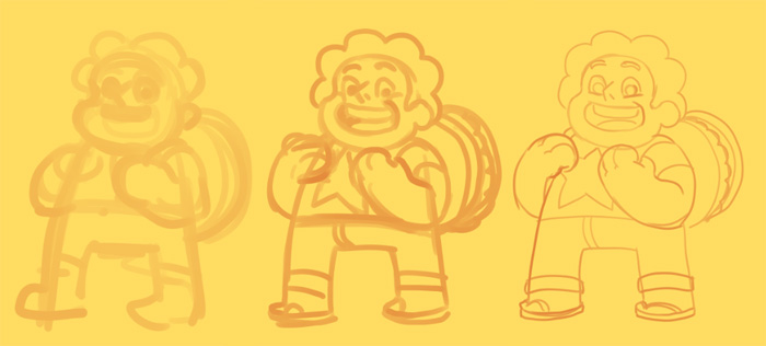
steven-sketches

As with anything, I start with a big, thick pencil tool to work out the main shapes of the figure. On a few different layers, I'll add tighter lines as I develop the drawing.

Screen Shot 08-25-15 at 12.32 PM 001

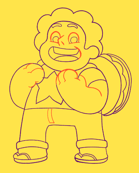
Now here's where things get a little tricky. It's my system for drawing final linework and establishing the colors at the same time. First, you might notice that I used two different colors at this stage. The purple is on a separate layer, and it's meant only to delineate the shapes of flat color. In other words, all those lines will disappear in the final art. The orange lines, however, are specifically the ones intended to stay through the end!

Screen Shot 08-25-15 at 12.32 PM 002You'll also notice that the line is fairly rough. I use my own variation on a Frenden brush to give that organic feel to my linework. My worry about doing art digitally is that the lines can get too crisp and lifeless, so it's my method of adding a little bit of texture to my work.

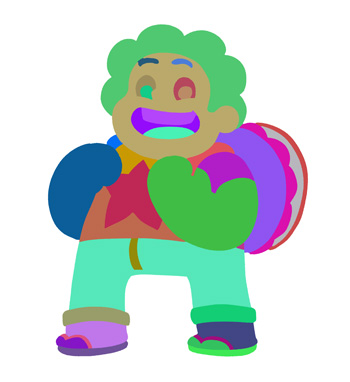
Once this stage is complete, I export the whole page as a PSD file and open it in Photoshop. I use a plug-in called BPELT to take that line drawing and turn it into flat shapes of random color! It looks crazy, but once we bring it back into Manga Studio, it will be easy to use the fill tool to incorporate all the actual colors of our dear Steven. (Just a note: the actual steps of using BPELT are a little complicated and technical. Be sure to follow its directions for the best results.)

steve-bpelt

Back in Manga Studio, I import the PSD and place it under that orange line layer. Fill in the colors however you like, and add different colors to the line layer, too!

steven-flat

At this stage, I was pretty happy with how Steven looked. In the actual cartoon, there's only minimal shading, but I wanted to add some highlights and deep shadows to give him a little more depth.

Screen Shot 08-25-15 at 12.45 PM 002

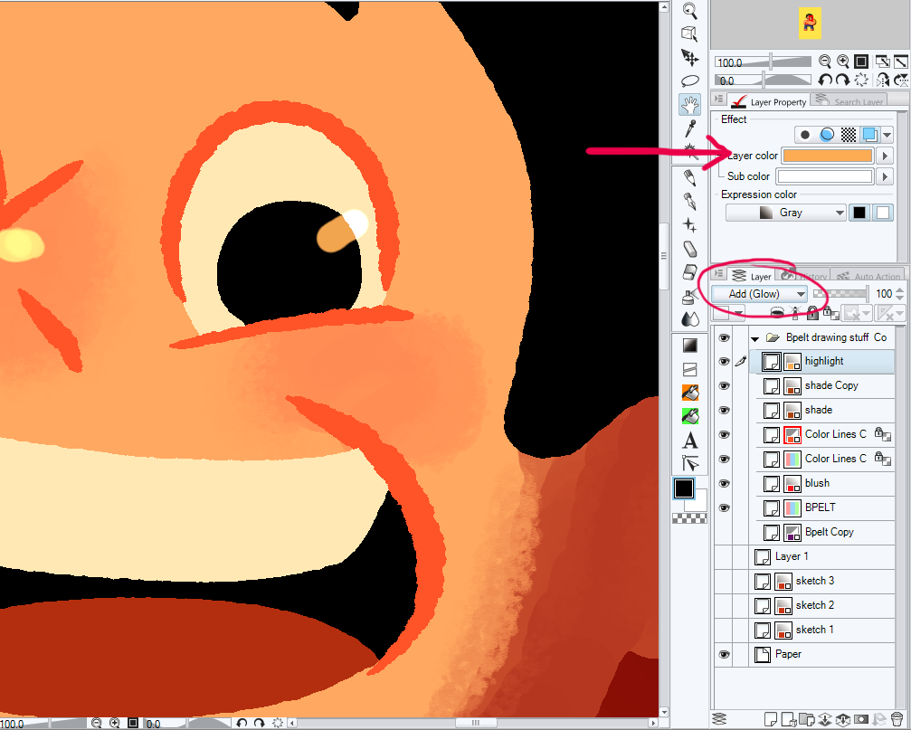
I made a separate “highlights” layer that uses the “Add (Glow)” combine mode, so that it lightens the layers beneath it. One of my favorite aspects of Manga Studio is that you can specify the color of specific layers. That means that whenever I draw on a layer, it will be in that particular hue. For highlights, I like to use a yellow ocher that gives a nice golden look to everything.

I add the shadows in a similar way, but I make the layer a darker brown and set it to a “linear burn” combination setting. I use a rough blending tool to soften some edges of the shadows, but I don't like to overdo it!

Screen Shot 08-25-15 at 12.54 PM 001

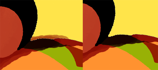
You might notice the clean, sharp edges of the colors and shading. How do I get that? Well, because the original flattened colors are still their own layer, I can use the wand tool to select whatever area I'm working on and restrict my shading and highlights to that specific area. Alternatively, I can clean up any shading that spills over an edge by selecting the area outside it and simply deleting that part of the shade layer!

steven-adjustment

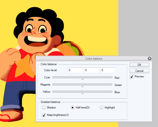
It can be a real challenge to decide when a piece is “done,” to determine when there's enough detail and enough contrast. But since Steven's aesthetic is so bold and simple, I wanted to have a similar look with this piece. I made the final adjustments of his color palette using the color balance and saturation tools, and then it was done!

steven

If you have any questions, ask them in the comments section, on Twitter, or Facebook!

PATREON TUTORIAL #2 (For Patreon supporters only!)

Hello! You might not have heard much from me lately, because I've been hard at work in the early stages of developing The Cardboard Kingdom! I'm working with each collaborator on their script, and once we've gone through a few drafts, I move on to the comic version, which I call my "doodle draft!" Because I've gotten so involved in that part of the process this month, I thought I'd share some of my thoughts on this crucial aspect of creating a comic. It can be really rough transitioning from a written script to an illustrated page -- so much can be lost in the process, so many abstract concepts and verbal descriptions that just don't work when you try to actually draw them! But you can gain so much, you can figure out so many new aspects of your story once you start working out your plot on the page and moving your characters throughout their imagined spaces. That's why I try to start my doodle drafts fairly early in the process -- it's not worth sinking too much time into a written script since so much of it will change when translated into the confounding language of comics!

storymanager

As I mentioned in my previous tutorial, I use Manga Studio 5 EX for all my comics work. Its ability to manage multiple pages in a single project allows me to work on the whole book right away, even if that just involves short written descriptions of what happens on each page. Seriously, my first step is usually just blocking out, page-by-page, the very general stuff of my story, like, "We first meet Ken" or "Dinner with Grandparents." (I'll mostly be using examples from my autobio comic VREELAND throughout this tutorial.)

That first stage of allocating plot points to specific pages helps you work out the pacing of your story, and it might make you realize, "whoops, I'm trying to squeeze waaaayyyy too much stuff in here!" You can also plan for which pages will be paired together (if they end up in a printed book) and where you'll incorporate double-page spreads!

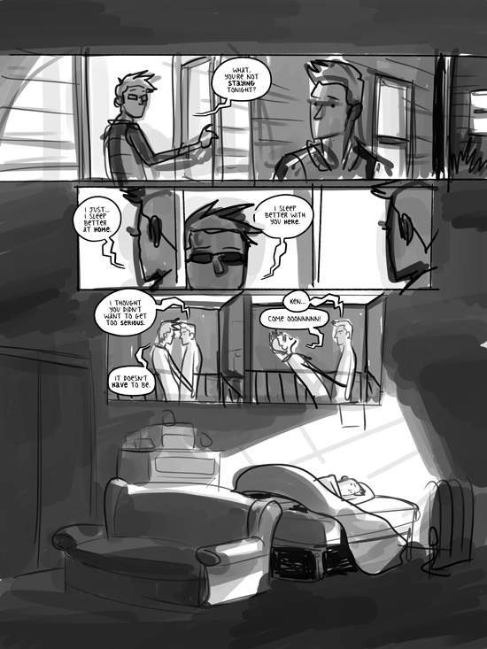
rough-sketch

Once I start sketching out the panel layouts of each page, I try to incorporate the dialogue right away so that I'm allowing enough space for it and fine-tuning the timing of each sequence. I try to avoid any large blocks of text or squeezing too many balloons into any single panel. During this part of the process, you can figure out where things can be left unsaid, where a silent panel or pained expression might convey so much more than any written word could.

And since it's all just rough sketches, you're not terribly invested in any particular panel, so you're free to move stuff around and try different solutions to your narrative conundrums.

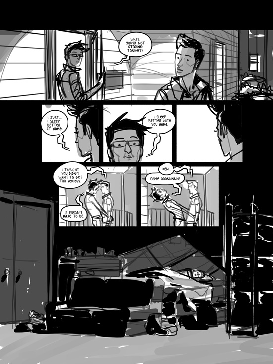
line-art

In my early days of making comics, I would often take reference photos of every single character in each of their poses throughout the comic, and I'd spend countless hours fussing over minor details of anatomy, expression, and clothing. But that started to really sap the joy out of my process, and it often resulted in lifeless pages full of detail, but sadly lacking in style.

So that's when I started making my "doodle drafts," where I'd just jump right in and sketch out a quick, goofy version of my story. And surprisingly, I'm often able to work out a lot of the expression and basic poses of the characters in that stage -- sometimes, barely any more work is needed for the final inking of my art! Certainly, some more complicated scenarios will require more refining, but so much of the visual storytelling and "acting" of the characters is accomplished at this stage.

doodle draft

The above image is what I consider the final "doodle draft" version of this page. I can't even tell you how helpful it is to have a readable rough draft like this so early in the process! By working loosely like this, you're able to flesh out whole scenes without a ton of effort, but you're also able to convey your intent behind the story. You can show your early drafts to friends and family for feedback without caveats or explanations. You can work out so much of your story like this and revise it however necessary.

With my doodle drafts, I also try to work out the nuts and bolts of how the final art will look. With VREELAND, I worked with black line art and some graytone shading. It's incredibly useful for me to establish early on where the areas of total black will be, where I'll use graytones, and what background details are necessary. Before I started figuring all that out with my doodle drafts, I'd often leave those decisions until the final stages of inking my art, which would result in a lot of second-guessing, back-pedaling, and comic pages that fell short of my ambitions.

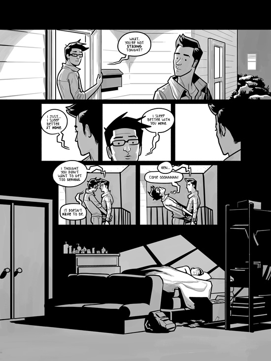
final-page

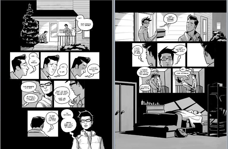
This is the final, inked version of the page. You can see that I worked out so much of the layout early on, allowing me to refine it during the last few steps of finishing it. I was able to pull out details, simplify expressions, and bring the page together as a whole. I was also able to ensure that the page worked with the preceding one in the sequence so that they served well side-by-side in the final printed book!

Screen Shot 07-14-15 at 05

CK-doodle-draft

Like I said, I'm in the "doodle draft" stage right now with a lot of my new Cardboard Kingdom stories! It's such a cool part of the process, especially since I'm working with great collaborators! And that's why it's even more crucial to develop the doodle drafts, allowing everyone involved to discuss a readable draft of each comic that's representative of the final stories!

Obviously, I can't show much of that work without spoiling all the good stuff, but here's a little peek at an emotional sequence with one of the character's fathers. We were trying to squeeze in a lot of expressions and nuance in the that scene, and even with such simple illustrations, we've been able to develop it into something really special.

PATREON TUTORIAL #1

The most frequent question I get about my work is: “What do you use to do that?” With the wide array of tablets, computers, drawing apps, and expensive (cough, Adobe) programs out there, it might be daunting for an illustrator to start drawing digitally. So I'm going to share the set-up I've been using for the last several years!

First, I should tell you that I don't have a state-of-the-art set-up, and it's certainly not anything particularly fancy.

I work on a cluttered desk with dual monitors hooked up to a Windows desktop. I highly recommend getting a graphics card with dual output, since it gives you flexibility for all sorts of configurations!

beingstupid

One of the monitors is a Yiynova MSP19U, which is what I draw on for hours and hours every day. It's an obscure Chinese brand, and I think it's only available in the US through a small importing business that sells them on Amazon. (I don't know anything about the larger model, the MVP22U, except that it costs more.)

There are much bigger, fancier, and expensive options out there. The Wacom Cintiq is the most widely-known tablet monitor, but the current desktop models run from $1,799 to.... $2,799? That's... that's a lot of money.

I bought my Yiynova MSP19U two years ago based on Ray Frenden's review. He's become an amazing resource for information about digital illustration tools, and he also sells gorgeous brush sets to use in a variety of graphics programs.

In any case, the Yiynova MSP19u costs $549 on Amazon, plus $30 shipping. It's not perfect, but despite its flaws, I've come to love the damn thing.

Yiynova

It's a decent size for me, especially since I'm squeezing an additional monitor onto my desk space. It's not especially high resolution (just 1440 x 900) but it feels fine to me. It has an extremely bright LED display with a glossy glass surface. There aren't any “hot buttons” along the side, but I've never been a big fan of those, so I don't particularly care.

I really like drawing on this thing. It just feels good! Drawing on the glassy surface will probably take you a while to get used to, but I'm a big fan. The pressure sensitivity is a good match for my drawing style, too. That's something to watch out for when looking at different devices for digital illustration – using a basic stylus on your iPad won't offer pressure sensitivity, which is crucial for any serious linework.

workingonit

It has a very simple stand while will allow you to angle it as needed – I like to get right up on there, bathing my eyes in its intense radiance. It's a little too hefty for me to comfortably hold in my lap, but I wouldn't want to, anyway. When I'm working, I draw with my right hand and occasionally tap in keyboard shortcuts with my left.

If you couldn't tell, I like the Yiynova's hardware quite a lot! But it's the driver that will get you.

If you're interested in the monitor, I would recommend googling around regarding how it will work with your particular set-up. One particularly weird technical quirk is that it requires VGA input, which is fairly outdated. I use a VGA to DVI adapter without any problems. It also requires a USB connection.

If you look around online, you'll probably read about all sorts of weird problems people have with the device's drivers. Yup. I installed mine without any problem using the installation software that came with the product. I had read about problems with the newer versions of the software, so I've just stuck with the older stuff. But I do regularly come across problems, and yeah, they're annoying. If I'm working in one graphics program, then open a different one, the tablet's pressure sensitivity often stops working. If I “wake up” my computer after putting it to sleep, the tablet often won't work at all, until I restart the entire computer. Stupid problems like this come up all the time. So, be warned.

stylus

You draw on the Yiynova with a fairly bulky stylus that requires AAA batteries. I generally enjoy using the stylus, but it's fairly flimsy, and it's prone to breaking or warping if it so much as rolls off your desk and falls to the floor. The batteries last quite a while, though, so that won't be costly. A replacement stylus, however, costs $40. And no, I haven't gotten any other styli to work on the monitor.

If you're looking for a cheaper way to break into digital illustration, you can definitely look into drawing tablets, which come in a variety of sizes, and at much lower price points. (The Wacom Intuos is worth checking out!) I used them extensively in my early days as an artist, though there's a serious disconnect between drawing on something in your lap that only shows up on your desktop monitor.

ms5

Okay, if you're still reading this after getting through all that boring tech talk, let me tell you the good news about MANGA STUDIO 5 EX. I've become sort of an evangelist for this program, but it's because I have a deep, deep love for it, and I've spent countless hours producing nearly all my art with it.

You can make a lot of comparisons between Manga Studio and Photoshop. But here's the thing: Photoshop is made for editing photos. Manga Studio is for making comics, glorious COMICS! I had used Photoshop exclusively for years and years, but when I tried out Manga Studio, I realized what a huge improvement it was to be making comics in a program made for making comics. Plus, it's so much more affordable than Adobe products. The basic version of Manga Studio 5 is available on Amazon for $40! The professional version, 5 EX, is $123, and worth every penny. (I'll try to discuss some of the features in the pro version later, but you can find an exhaustive comparison chart here.)

My very favorite thing to do in Manga Studio is draw. Its tools for linework are glorious! The biggest problem with doing any digital illustration in any program is that drawing with a plastic nib on a monitor just isn't the same as using a nib or pencil or marker on paper. The texture isn't there, nor is the fabulous, steadying friction of the surface. That can lead to really wobbly lines, which can make you feel like a child again, struggling with basic issues of hand-eye coordination.

stability2

But Manga Studio offers a huge array of stabilization settings – you can leave them turned off for a really natural, organic line, or you can utilize moderate stabilization for smoother lines. When I'm drawing something that needs to look especially geometric or architectural, I turn the “correction” settings way up so that I can draw subtle curves and straight lines effortlessly!

stability

Manga Studio comes with a wide array of pencil, brush, and pen tools, but you can supplement those with Ray Frenden's gorgeous custom brushes. You can also dig into the settings of any tool to customize them exactly as you like – even adjusting the pressure curves, which I love to get just right.

strokes

MS5's coloring and painting tools are quite lovely, too, but if you're making comics, the essential features are its panel tools and the Story Creator! MS5 has fairly intuitive tools to make panels and create nice, clean borders for your comics. (I used to give myself painful wrist problems holding my ruler steady when drawing them on paper!)

If you're more interested in doing digital illustration rather than actual comic books, the cheaper Manga Studio 5 package might work for you. And you can even experiment with a trial version if you're curious about it! But if you're working on multiple page comics, you'll need Manga Studio 5 EX. The Story Creator is exclusive to the pro version, and it's become an absolutely essential component of all my comics projects.

storymanager

With MS5 EX, you can create multiple page projects, meaning that you can view all the pages in your comic, move them around as needed, and simply click one to start drawing in it. From my earliest rough drafts, I'm working page-by-page in Manga Studio, blocking out pages and working on the panel breakdowns. As I develop the story, I can switch out pages, try different configurations, and even establish double-page spreads wherever I like! You can even export the entire project (or whichever pages you want) as layered PSD files or flattened images for printing!

I'd be happy to discuss some of Manga Studio's features in more depth for future tutorials, so let me know what you'd like to hear about!


This tutorial was made possible by my supporters on Patreon! Find out how to help me keep doing what I do there!
RuPaul's Drag Race: Season 7, Episode 13

So, the "RuCap" week of each season always offers a break from the frantic pace of the show. It's a chance to reflect on the highs and lows of the past few months, and most importantly, to get a whole lot of catty commentary from all our favorite queens of past seasons. Has Season 7 felt a little weird? Yes. Do most viewers really care who wins? I don't, not really. But over the course of the season, we have gotten to meet some really stellar characters on this show, and I wanted to take some time this week to reflect on my own experience drawing them.

In past years, I've used the RuCap episode as a chance to go back and illustrate any of the important runway looks that I might have missed. But this season, I illustrated a lot of them, and there's only one outfit left that I was dying to draw:

Kennedy
Kennedy

I actually had a ton of fun illustrating Kennedy's look. Crazy feather/fur stuff! That mug! The blood! It may have been a totally crazy choice, and her story for the runway might not have made any sense, but it sure burned an image into our minds that will stay crystallized forever. (do you see what I did there?)

max-heartless-color
max-heartless-color

There have been plenty of complaints about this season's emphasis on scripted acting challenges, and rightfully so. But looking back, there were some legendary runway themes, too. Both the "Death Becomes Her" and "Bearded Beauty" ones just gave me life, so many stunning concepts and costumes that inspired some of my favorite Drag Race illustrations ever!

The "Conjoined Queens" and "Dancing Queens" challenges were trickier for me to draw, but I loved them. Such crazy creativity and just, well, craziness on that runway.

With a season of so many stunning creations, I wish their actual construction would have been more of a priority. I wanted to see these queens come up with them, or discuss their collaborators at home. It seems to me like the emphasis in editing was on interpersonal conflict rather than costume construction, and that we rarely saw the best looks being put together in the workroom so that they'd be more of a surprise on the runway. Which is fair, but it seems like a disservice to queens like Max and Violet who display such extraordinary vision and skill in their craft.

violet-breathless-process
Trixie-icon-sketch
Trixie-icon-sketch

I felt like the season's focus on scripted comedy was a challenge for Trixie, too. Her strength is writing her own comedy, or improvising the bullshit and banter that's so special about live drag performances. It seemed like the show never knew what to do with Trixie, but I'm so glad that she won over so many new fans in her time on it.

I adore the queen, and I love depicting her shrink-wrapped aesthetic. When she was kicked off (the first time), I wanted to really boil down the essence of Trixie, to commemorate the quirky, ridiculousness of it all. And I'm thrilled that she uses that image on her official tank tops, which you've gotta break out for Pride season!

pearl-death-sketch
pearl-death-sketch

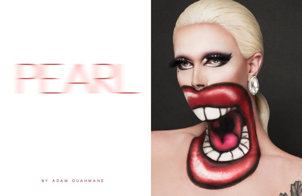
Someone remarked that my best work this season has been of Pearl's looks, and I can't really disagree. Going into this season, I wasn't quite sure what to expect of Pearl -- I knew her from her time in Chicago, and although I live for her look, I didn't know whether she'd bring much diversity to the runway or character to the workroom.

Pearl_death
Pearl_death

But she delivered. I mean, not always. She wasn't the most polished queen, and she didn't have the most gorgeous gowns. But there's something about her deranged approach to beauty that I find irresistible. She might not always pad, she might not always perform, but I always love what she's going for.

katya-collage
katya-collage

As I've mentioned a few times, Katya was my BenDeLaCreme this year -- my personal favorite, the one whose comedy and approach to drag just meshed with my own preferences the most. But in both cases, I struggled throughout the season trying to capture their likenesses! Katya's usual look is so striking, but so hard to pin down -- what makes her look like her? Obviously, it's SO much easier to depict the crazy characters she embodies so well.

Whenever I tried to depict Katya seriously, I struggled. Especially when trying to draw her incredible "Jet Set Eleganza" lip sync performance.

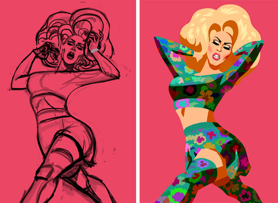
katya-jetset-process

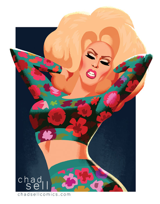
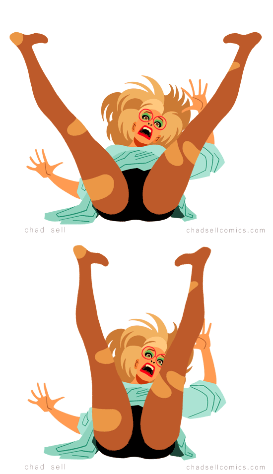
In my first few hours working on that illustration, I was trying to capture both her emotional intensity and her legendary legs as they did those slow-motion splits. But it just looked more and more awkward, and I was sure the piece would be an embarrassment.

Katya_jetset
Katya_jetset

I only turned it around at the very end when I realized I needed to crop her illustration differently, focusing solely on the arch of her back and her emotional intensity. But still, I was worried it was too simple, or the colors were too crazy, or.... I don't know. It was one of those pieces that put me through the wringer, questioning whether I should even share it online. Aside from its own merits as a piece of art, Katya's actual performance was so magnificent and memorable that it seems to have charged this fairly simple portrait with some of that same intensity. Or maybe it still sucks, I don't know.

In any case, I wanted to make one last, iconic portrait of my dear Katya. Something befitting her stupid talents and talented stupidity. And this happened:

katya-gross
katya-gross

I collect my favorite art from each season in little art books, (you can see all the previous season collections here) so I've been working through some ideas for who and what should be on the cover for Season 7. One of the final 3? I love Ginger, but I've been having a hell of a time capturing her likeness this season. Maybe Pearl or Violet? But which one? And then my personal favorites are Trixie and Katya, so.... well, here, take a look at my different sketches and let me know which one you'd like to see on 70 QUEENS!

cover-montage
cover-montage

Right now, in all honesty, I'm leaning toward the Katya one.

Regardless, I'll be putting together the book collection over the next two weeks, and I'll make it available for pre-order soon! While you wait, you can check out all my other Drag Race art on Etsy!

Or, if you'd rather not cover your walls with drag queens, you can support me viaPatreon!If you're not familiar with how that works, it's a way to support your favorite artists by sending a few bucks their way every month. I've just set it all up, so I'm going to keep it pretty simple right now, but I'm hoping to offer exclusive sneak peeks and sales to my supporters soon!

Patreon will be an ideal way to help me out once the Drag Race season wraps up, because I'll be turning my attention to The Cardboard Kingdom, a new collaborative comics project! I'm currently taking story submissions until June 15, then I'll pick a bunch of them to illustrate as fun, imaginative, socially-conscious kids' comics!

cons
cons

And FINALLY! If you're not sick of me after reading all this, you should come meet me at two shows coming up in June! CAKEin Chicago is a totally free and amazing indie comics show, full of talent, incredible art, and cool workshops! It will be June 6-7 at The Center on Halsted!

And FLAME CON is a new queer comics convention in Brooklyn! It's Saturday, June 13, and it will have SO MANY cool creators and special guests and stuff. Get tickets here! 

RuPaul's Drag Race: Season 7, Episode 10

Oliver Sava joins me this week to talk Drag Race! He's been covering the show for years at The AV Club, where he's a contributor on everything from comics to reality TV. 

Chad: So, you've written about the Drag Race for a number of years for The AV Club, and you've covered So You Think You Can Dance, so I thought you would be great to chat with about this week's challenge and what's been going on in general this season. Even if you're not a drag or dancing EXPERT, you know what makes good TV.

Oliver: It's perfect, because my dance knowledge is about as extensive as most of the queens on this episode. I got to see a lot of professional dance working front of house at Harris Theater, and that combined with SYTYCD and some college dance classes has given me a pretty solid foundation.

Chad: So what did you make of this week's performances?

Oliver: The actual dance performances were all entertaining. Nothing was a trainwreck. I absolutely agree with the judges and think Violet and Katya were the strongest, but I also think the Vogue Tango is probably the easiest of the three styles. Just because these queens probably have some basic knowledge of voguing, and tango gives them a very specific attitude to play.

violet-tango
violet-tango

Chad: Right, Katya and Violet were sleek and sexy as shit. But who the hell can pull off "country robot?"

Oliver: Country Robot and CHARLESTON TWERK

Chad: How do you think the choreography handled the double-gender aspect of their costuming?

Oliver: I don't think it took advantage of that very well. I didn't see the correlation between the look and the dance beyond that they both combined different things. But I would have liked to see a stronger connection drawn between the two.

Chad: I thought there were moments of wit -- during Katya and Violet's routine, when one pushes the other down as "the man," and then they switch roles. But yeah, I felt like the divided drag looks were more distracting than anything. Wouldn't that concept have worked better in a photo shoot, where it could be more precisely arranged?

Oliver: Maybe something even bigger than a photoshoot. Something that really forces the viewer to look at the relationship between the male and female halves. It's a visual that speaks so directly to the dynamic at the center of the show that I wanted it to get more attention

Chad: Maybe a segment like Stephen Colbert used to do: "Formidable Opponent!" Where he literally argues with himself over some topic, with just the camera orientation (and tie color) switching with each "side."

Chad: But it sounds like, overall, you enjoyed this week's challenge, right?

Oliver: I thought it was solid, but far from my favorite this season. It tries to do too much. And I don't necessarily mean in terms of the work the queens have to do.

Chad: I feel like that's a recurring theme this season. The producers get so caught up in their own clever concepts and shove the queens along to get it all shot for the episode. My general feeling about this season is that the challenges are just too heavily scripted, where the comedy is baked into the challenge, rather than forcing the queens to bring their own inventiveness to it.

Oliver: I totally agree with that.

Chad: Just let Ginger, Katya, or Trixie riff in front of a crowd, and you'll get comedy gold! Or even give them a talk show challenge, like Season 1 and Season 6! We're not getting enough improvisation challenges, and we're not getting fashion challenges. So we're not able to see the queens' wit (a la Trixie, Ginger, and Katya) or their visual creativity (Pearl, Violet, and Max.) That's the end of my rant, sorry. I was annoyed by this week's challenge.

Oliver: I think you're totally right, though. Lots of the queens reading lines. Or singing lyrics. Or dancing choreography. That is given to them by someone else.

Chad: I would have loved a more thoughtful "split gender" runway theme that wasn't catering to the challenges of dancing in the outfit.

Oliver: I agree. How would they interpret the male half if they didn't have to wear a tux?

Chad: Well, if you noticed, pretty much all the tuxes were actually just spandex bodysuits. I'm guessing that was for convenience and versatility. And what if they didn't have to divide the drag looks right down the middle? What kind of edgier, androgynous looks would we have gotten?

Oliver: The costuming confused me. I wrote about it in my review, but I just didn't know what the queens had to sew, and if they had to sew, what they were using.

Chad: I heard on reddit that Trixie said at a viewing party that they did, in fact, have to construct the garments in the workroom. Which sounds correct, given that each queen had a look catering to their dance style. In your review, you also had some interesting thoughts on Ginger and Trixie's issues on the show. You think Ginger is playing a pretty nuanced game, don't you?

Oliver: I get the impression that her struggles aren't as real as she makes them out to be. I went to the Season 7 premiere party and got to talk to Ginger, and she explicitly mentioned being a musical theater performer, and doing a little digging online revealed that she's also a costume designer. You've gotta dance and sew to do those things. You don't have to be an expert at them, but you need to have a basic knowledge to excel.

Chad: Yeah, she's been in the game a LONG time! She had this fabulous interview on Feast of Fun where she describes acting in a Broadway production of Beauty and the Beast for more than a year when she was 19!So right, when she says, "I'm not a dancer," that's not exactly true. She may feel insecure about dancing, it might not be her strength, but she makes a living as a musical theater performer and drag queen. You think she's playing up her vulnerability to be more likable to the judges and the viewership?

Oliver: I definitely think she's exaggerating her weaknesses. But I also just get a performative vibe from her in general.

Chad: I'm still pretty sure she's being set up to win the season, but I'm not rooting for her, yet.

Oliver: I'm all about Katya.

katya-housewife
katya-housewife

Chad: The issue is that Ginger comes across incredibly well in interviews and in her performances on Youtube. But something about her depiction on the show just isn't sticking with me.

Oliver: I don't really have a great idea of who the Ginger Minj character is. But a lot of the queens this season don't necessarily project a strong personality in drag.

Chad: The feeling I get is that the show has been depicting her as folksier and shadier than she really is. In interviews, she comes across as very well-grounded, smart, sweet, and hilarious.

Oliver: Is it the show, or is it her, though? They can't edit it if you don't do it. If you've been watching a show for six seasons, you know what works and what doesn't.

trixie-country
trixie-country

Chad: Well, right, I really have no idea. I do know that Trixie and Katya both LOVE Ginger, which is good enough for me. Because, yes, I love Katya, too, and I was very sorry and frustrated to see Trixie go. It felt like a very arbitrary decision. Like they just didn't know what to do with Trixie after they brought her back!

Oliver: Ginj beat Trixie in that lip sync, though.

Chad: Yeah, I dunno. I hate the way they edit those lip syncs. I just want a split screen that shows both queens in a medium shot. Because I am a boring old man who wants to see his queens.

Oliver: They should do that as an online exclusive thing.

Chad: Yup!

Oliver: Lip Sync Split-Screen, sponsored by SquareSpace.

Chad: Ha! So, speaking of SquareSpace.... What do you think of Untucked this year?

Oliver: I'm a few episodes behind, which should tell you how high of a priority Untucked is now that it's online

Chad: What, really??

Oliver: Yeah, I don't love it. I get what they're going for, but it doesn't have the same energy as before.

Chad: Okay, I think that's fair. I'm sure the response to its stylistic change has been divided. But I LOVE it. So much. Here's my take on it: I think they had barely any budget for it this year. So they tried a ballsy approach, tried something different.

Oliver: I miss the tight space. It was like putting animals in a cage, sticking tired drag queens in the Interior Illusions lounge with alcohol and watching them claw at each other.

Chad: But I think it's so intimate, crazy, and unstructured. There are moments of hilarity, of poignance, and of Katya just twerking in the parking lot.

Oliver: It does feel more real, which is fun.

Chad: I just think it's shot in such a fresh way, where you really get the feel for what it's like to spend twelve hours with a bunch of tired queens, and honestly, I wish they'd approach the whole show the same way. I don't think they WILL, but I can wish for it.

Oliver: There have been some solid moments. I really liked Violet's "I get it, I'm a bitch" moment. But I don't think I want a raw, grounded RuPaul's Drag Race. I like it silly and overblown. I just think this episode lacked focus.

Chad: Yeah, and you're probably in the majority with the rest of this show's fans. I just feel like most of the episodes this season have felt too rushed, too arbitrary, without any room for the queens to breathe and to shine.

Oliver: Is Violet the only queen that hasn't lip synced?

Chad: Hm. Seems so! What do you think of Violet?

Oliver: There's also not much interpersonal drama this season. I appreciate Violet because she was stirring shit up! That makes for interesting TV.

Chad: Although we've seen her deal with the "bitch" characterization, we know next to nothing about her personal life or her history. Where are her childhood tales of adversity? Parental acceptance?

Oliver: Maybe she didn't have to struggle.

Chad: Right, maybe there's no drama to mine. Do you have any other thoughts on this season, this episode, or any particular queens?

Oliver: 1) Two thumbs up for boy-Pearl with facial hair. 2) Flassez-da. 3) Rachael Harris' face when RuPaul pulled off her skirt. That is how I would look the entire time if I was a guest judge on this show.

pearl-divided
pearl-divided

Chad: Agreed, I love a scruffy Pearl. Too bad it was painted on!

Oliver: It was a good week for Pearl, who I'm shocked is still in the competition.

Chad: Why are you shocked Pearl is still in the game? Because she lives her life in slow motion?

Oliver: It definitely feels like she's coasting her way through, but it's not bad. That's just her personality

Chad: That it is.

Oliver: She's managed to keep that aloofness, but there's more energy behind her performance now. She's starting to have fun, and it's making a big improvement.

11208723_10101201207951631_1246758568_n

You can find Oliver's weekly write-ups of the Drag Race right here! You can also check out all his other writing for The AV Cluband for The LA Times Hero Complex! Oliver is also on Twitter.

If you like this week's art, check out the posters, prints, and postcards available on my Etsy store!

RuPaul's Drag Race: Season 7, Episode 7

Hello! Due to scheduling conflicts, I wasn't able to do an interview discussion for this week's episode. The Snatch Game is always a hot mess, but usually there's at least one shining star who emerges above the fray. In Season 5, it was Jinkx, and in Season 6, BenDeLaCreme stole the show, but Adore and Bianca were both magnificent, too. This season, I thought a lot of the performances were solid, but not stellar. I would have picked Katya for the win, but that's true pretty much every week.

I was very surprised and sorry to see Max go. Some queens seem to get second and third chances on this show, but Max didn't. Although I think she has the most intriguing aesthetic this season, she was perhaps too reserved a character to make for good reality television.

As always, you can find all my latest art on Etsy!You'll also be able to find me at C2E2 in Chicago next week! I'll be in Artist Alley, Table A4.

I'll also be announcing a super-exciting new comics project tomorrow. So stay tuned!!

Katya-Suze
Katya-Suze
Max-Black Widow
Max-Black Widow
Pearl-Big Ang
Pearl-Big Ang
Violet
Violet