PATREON TUTORIAL #4: Gettin' Sketchy
Although the vast majority of my work is done digitally, sometimes I need to set aside the screen and draw on some paper. Although digital illustration gives you a tremendous amount of versatility and options for your work, those endless possibilities can prove creatively daunting. With so many tools at hand, I sometimes find myself losing my way – whether that's because I'm on week 10 of my Drag Race season, and I've been drawing the same damn thing for too long, or because I'm struggling to find the right style for an entirely new project. There's a set of tools and techniques I reliably turn to when I need to relax, loosen up, and let the ink fly.
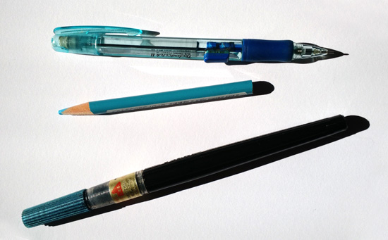
My favorite tool for doodling lately has been my trusty old Pentel Brush Pen. It has enormous brush bristles, so it provides an extreme variety of line widths. And the dry brushing! Oh, such TEXTURE! You can squeeze the handle to send more ink into the brush, but sometimes it pays to exploit the gorgeous textural stuff that the Pentel provides as it's going dry.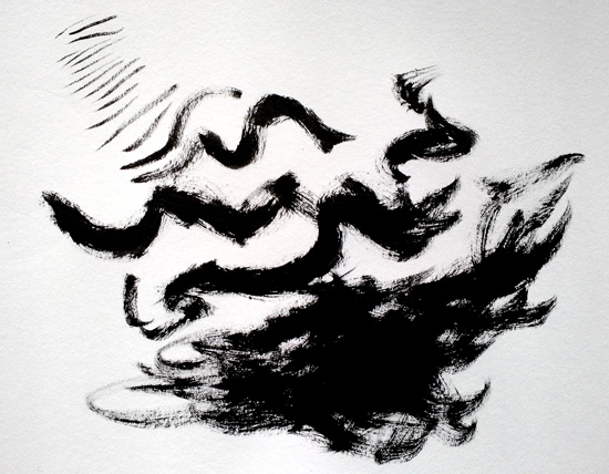
The Pentel is one of the most popular brush pens around, and it's also quite affordable. You'll probably see it at a fair number of art supply stores, and you can find them and their refills online. The one I use is probably about 10 years old, and it's still serving up its delicious, thick inks.
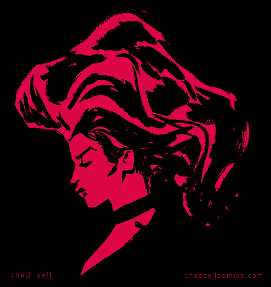
I should warn you of a few peculiarities about the Pentel. The extreme variation of line width it offers also makes it difficult to be too precise or delicate with your linework. That can prove frustrating until you learn to embrace the Pentel's extremes and utilize that unpredictability to loosen yourself up.
Also, the ink is weird. Like, you'll find yourself smudging it and making a mess unless you learn to leave it alone until you're absolutely sure it's dry and will behave. The ink is water soluble*, so don't plan on using any ink washes or watercolors with it, unless you want things to get very runny. (*In my previous tests, the ink was water soluble, but apparently some refills are not? So, you should check for yourself!) I use Copic markers extensively with my Pentel doodles and don't have any problems.
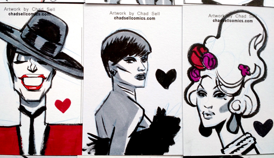
You might have a lot of fun just going to town with the Pentel and some paper, but I prefer to lay out rough sketches before inking up a page. My favorite tool for that sketching phase is the Prismacolor non-photo blue pencil.
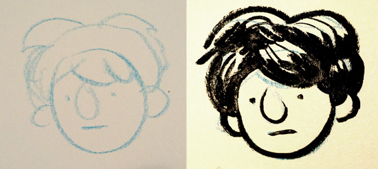
If you've ever stepped into an art supply store, you know that Prismacolor pencils are expensive. But they're also extraordinary. Their leads are soft and buttery, which is great for big, loose sketching that suits the linework you'll ink later with the Pentel.
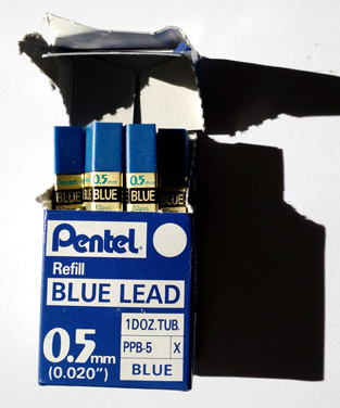
Alternatively, I also really love using non-photo blue leads in a mechanical pencil holder. You might not have realized it, but you can buy replacements leads for mechanical pencils at high quantities for low prices. And better yet, you can buy them in different colors or densities, just so long as you make sure the lead width matches the pencil holder you're putting them in! I use these Pentel non-photo blue leads, which offer a very delicate, precise line.
If you're wondering what “non-photo blue” pencils are, they're a holdover from old school design techniques. This particular shade of blue is designed so that it doesn't show up in black and white photography or old Xeroxes. Which sounds like a super cool magic trick, except that it will absolutely show up in your digital photos or scans. However! This color, because it's light and bright, is easy to Photoshop out of your work. There are a number of methods that will work, but I go to the “channels” section of Photoshop, select the Blue one, then copy and paste it into a new document! That should largely get rid of the blue sketch underneath your inked art, and then using some level adjustment will get rid of the rest!
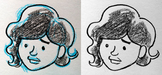
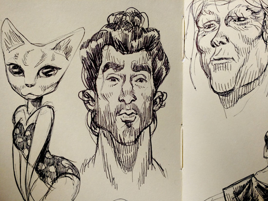 In the spirit of loosening yourself up, sometimes keeping things tiny will help, too. I really enjoy sketching in my tiny Moleskine book, because the little pages will keep you from getting too precious or detailed with your work. I find myself using a simple Bic pen in my Moleskine, because I can get incredibly delicate lines that work perfectly at that small size.
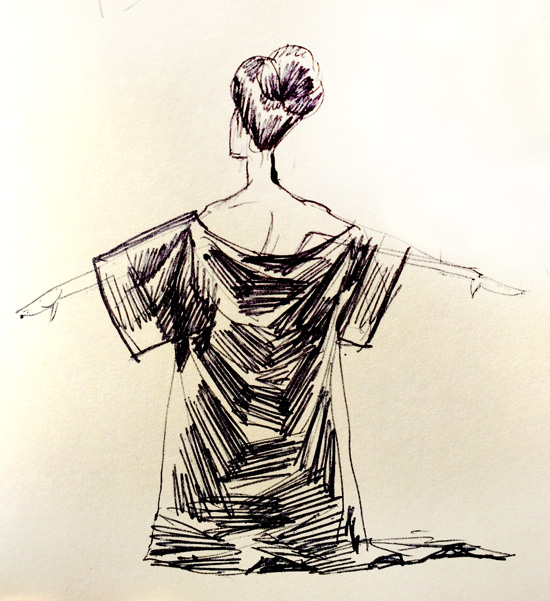
When sketching in a larger sketchbook, I find myself using either the Pentel or an Ebony pencil. I find that the Ebony gives me a soft, chunky line that's perfect when I'm doing character designs for The Cardboard Kingdom, the giant new comics project I've been working on the past few months!
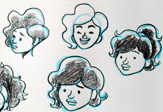
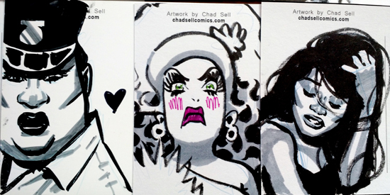
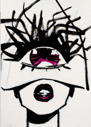 I really look forward to my monthly postcard sketches for my Patreon supporters, because they're fun little doodles where I can experiment and let the weirdness flow. Like I said, I use Copic markers for these, specifically different gray tones that work well for shading. They don't seem to mess up the Pentel ink, and they add a great sense of solidity to the final work. I should note that I avoid Prismacolor markers, because their fumes give me massive headaches. Copics smell a bit, but they don't seem to have the same effect on my poor brain.
I hope some of these pointers have proven useful! Let me know if you have any questions about the materials or techniques! My monthly tutorials and process peeks are made possible by my amazing supporters on PATREON!
