PATREON TUTORIAL #2 (For Patreon supporters only!)
Hello! You might not have heard much from me lately, because I've been hard at work in the early stages of developing The Cardboard Kingdom! I'm working with each collaborator on their script, and once we've gone through a few drafts, I move on to the comic version, which I call my "doodle draft!" Because I've gotten so involved in that part of the process this month, I thought I'd share some of my thoughts on this crucial aspect of creating a comic. It can be really rough transitioning from a written script to an illustrated page -- so much can be lost in the process, so many abstract concepts and verbal descriptions that just don't work when you try to actually draw them! But you can gain so much, you can figure out so many new aspects of your story once you start working out your plot on the page and moving your characters throughout their imagined spaces. That's why I try to start my doodle drafts fairly early in the process -- it's not worth sinking too much time into a written script since so much of it will change when translated into the confounding language of comics!

As I mentioned in my previous tutorial, I use Manga Studio 5 EX for all my comics work. Its ability to manage multiple pages in a single project allows me to work on the whole book right away, even if that just involves short written descriptions of what happens on each page. Seriously, my first step is usually just blocking out, page-by-page, the very general stuff of my story, like, "We first meet Ken" or "Dinner with Grandparents." (I'll mostly be using examples from my autobio comic VREELAND throughout this tutorial.)
That first stage of allocating plot points to specific pages helps you work out the pacing of your story, and it might make you realize, "whoops, I'm trying to squeeze waaaayyyy too much stuff in here!" You can also plan for which pages will be paired together (if they end up in a printed book) and where you'll incorporate double-page spreads!

Once I start sketching out the panel layouts of each page, I try to incorporate the dialogue right away so that I'm allowing enough space for it and fine-tuning the timing of each sequence. I try to avoid any large blocks of text or squeezing too many balloons into any single panel. During this part of the process, you can figure out where things can be left unsaid, where a silent panel or pained expression might convey so much more than any written word could.
And since it's all just rough sketches, you're not terribly invested in any particular panel, so you're free to move stuff around and try different solutions to your narrative conundrums.
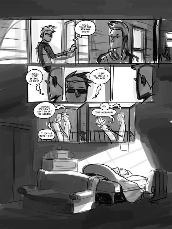
In my early days of making comics, I would often take reference photos of every single character in each of their poses throughout the comic, and I'd spend countless hours fussing over minor details of anatomy, expression, and clothing. But that started to really sap the joy out of my process, and it often resulted in lifeless pages full of detail, but sadly lacking in style.
So that's when I started making my "doodle drafts," where I'd just jump right in and sketch out a quick, goofy version of my story. And surprisingly, I'm often able to work out a lot of the expression and basic poses of the characters in that stage -- sometimes, barely any more work is needed for the final inking of my art! Certainly, some more complicated scenarios will require more refining, but so much of the visual storytelling and "acting" of the characters is accomplished at this stage.
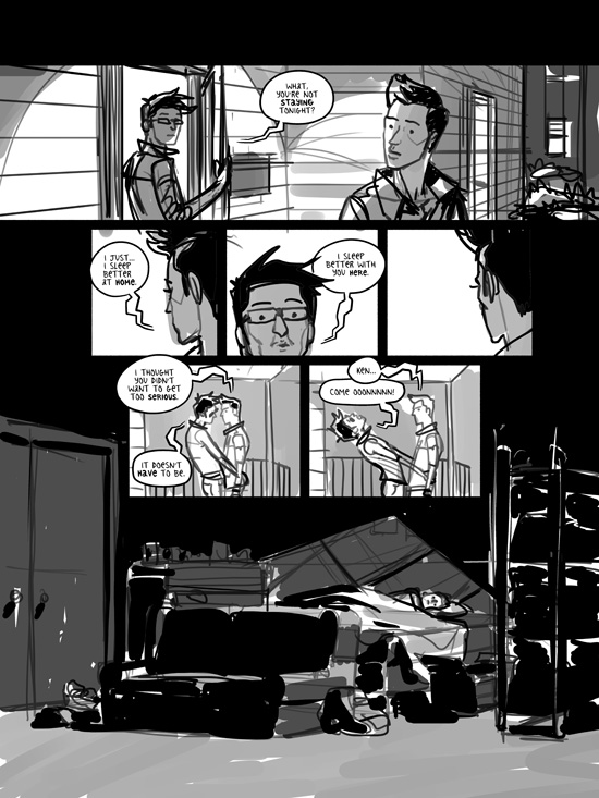
The above image is what I consider the final "doodle draft" version of this page. I can't even tell you how helpful it is to have a readable rough draft like this so early in the process! By working loosely like this, you're able to flesh out whole scenes without a ton of effort, but you're also able to convey your intent behind the story. You can show your early drafts to friends and family for feedback without caveats or explanations. You can work out so much of your story like this and revise it however necessary.
With my doodle drafts, I also try to work out the nuts and bolts of how the final art will look. With VREELAND, I worked with black line art and some graytone shading. It's incredibly useful for me to establish early on where the areas of total black will be, where I'll use graytones, and what background details are necessary. Before I started figuring all that out with my doodle drafts, I'd often leave those decisions until the final stages of inking my art, which would result in a lot of second-guessing, back-pedaling, and comic pages that fell short of my ambitions.
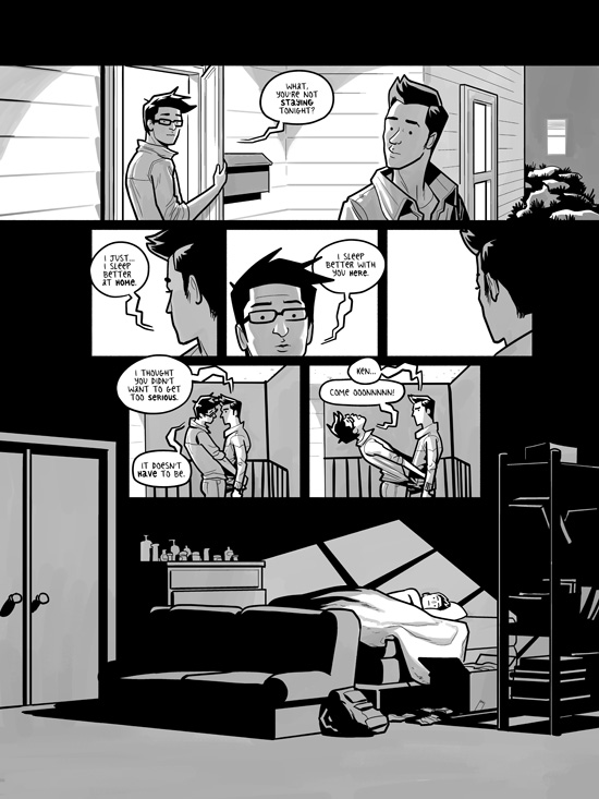
This is the final, inked version of the page. You can see that I worked out so much of the layout early on, allowing me to refine it during the last few steps of finishing it. I was able to pull out details, simplify expressions, and bring the page together as a whole. I was also able to ensure that the page worked with the preceding one in the sequence so that they served well side-by-side in the final printed book!
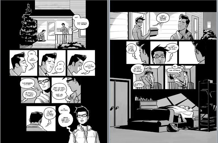
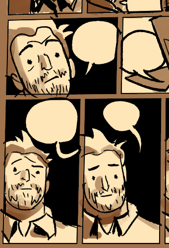
Like I said, I'm in the "doodle draft" stage right now with a lot of my new Cardboard Kingdom stories! It's such a cool part of the process, especially since I'm working with great collaborators! And that's why it's even more crucial to develop the doodle drafts, allowing everyone involved to discuss a readable draft of each comic that's representative of the final stories!
Obviously, I can't show much of that work without spoiling all the good stuff, but here's a little peek at an emotional sequence with one of the character's fathers. We were trying to squeeze in a lot of expressions and nuance in the that scene, and even with such simple illustrations, we've been able to develop it into something really special.