Some Drag Race fans have been asking about the process of creating my fan art, so I wanted to share some of the steps in creating my "Money" look for Raja, even though my methods continue to evolve.
It all starts while watching Rupaul’s Drag Race every Monday night--as the girls start coming out onto the catwalk, I grab my sketchbook and start laying out loose, gestural poses and ideas.
You can see from these samples how rough and simple this process is--I've found it's better to work out ideas with quick sketches while figuring out your plan, rather than investing too much energy in the first drawing you come up with.
(Aaaand since I don’t have a DVR to pause the show, I have to work quickly to keep up!)

My favorite catwalk looks tend to be the most striking and distinctive ones, which is why I've drawn Raja each and every week-- her frequent use of varied cultural and historical fashions conjure up a slew of associations and ideas for me to work with. In this case, I saw Raja as the star of a lavish 1930’s musical.

I decided to go further with this drawing. Although I (clearly!) still needed to work a lot of stuff out, I liked the angle of Raja’s head, her hat, her torso, and her arms.

At this point, I scan in my sketch, move things around, then print it out a little larger. For this part of the process, I use a lightbox-- a fresh piece of paper is placed on top of the print-out, and the light shining through both layers of paper allows me to derive a more refined sketch from that chaotic first drawing. You'll see I also changed the position of both her arms and her legs.

During the lightboxing process, I frequently flip over the drawing and look at its mirror image, which allows you to see the weird assymmetries in your work--it's a horrifying (but essential) trick if you want to fix the strange distortions that would otherwise go overlooked.
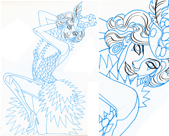
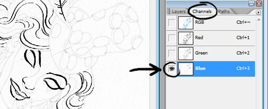
Once the new drawing is done, I scan that, too. You’ll notice the use of both blue and black pencil--the blue is for the sketching process, where I'm still trying out different ideas. Then, in Photoshop, it’s easy to knock out those blue tones, so you’re left with a cleaner image.

At this point, I kept switching things around, subtly changing the pose and blocking in some rough colors to get a better idea of the final piece.
At the last minute, I decided to bend Raja's leg up and loosely sketched it in with my graphics tablet. I was starting to get worried that the pose looked too unrealistic and weird, which is often the case. One of the tricky things about the Drag Race portraits is determining when my simplification and exaggeration of the figure looks good, and when it just looks f*&ked.

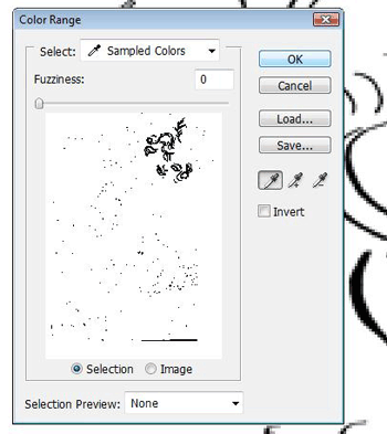
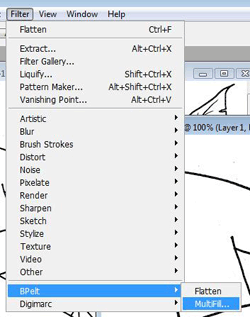
Back to the lightbox! Here, I do the final drawing in both blue and black ink. The reasons for that get kind of complicated, so click here to go to my "technical addendum" if you want to find out more about some of the more elaborate Photoshop tricks I use.
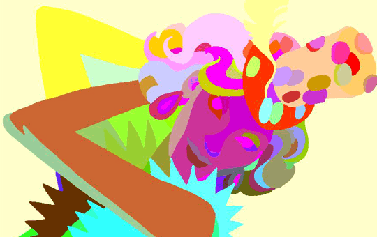
With my earlier Drag Race art, I would literally just draw each shape with a polygonal "lasso" tool in Photoshop, though I switched my process about halfway through the season. Now I'm able to use this final drawing to serve as a guide in which Photoshop is able to assign different blocks of color to each section, according to my specifications. Depending on the complexity of the drawing, it can take a while to go through and individually designate all the colors that will go into the final piece.
It's a tedious process, but it's exciting to see the portrait start taking shape. And once that’s done, I begin fussing over everything else--where to throw in some texture, tweak the face, fix things that aren’t the right size or are at the wrong angle.

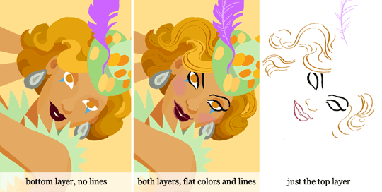
This is the first Drag Race portrait where I finally let myself use line-- for my previous pieces, I had always forced myself to use flat shapes of color (with added textures and shading for some, of course) but I wanted to try incorporating a little bit of line while keeping to the style I've developed over the course of these past few months. I tend to rely too much on linework in my other art projects, and one of my favorite aspects of this Drag Race illustration series has been that it's rejuvenated my love of, and confidence in working with, COLOR.
For better or worse, I only settle on the final layout at the end of the night, as I'm starting to go crazy from spending too many hours at the computer. I played around with a few different ways of framing Raja and finally came up with the giant burst of yellow to use as the background.
 And there you have it! Working on all this Drag Race art has been an incredible experience on a number of levels-- it's been thrilling to keep pushing my abilities further while earning such a great response from other fans. I hope this little write-up of my process has been informative and maybe even a tiny bit inspirational.
Again, check out my "technical addendum" for more specific Photoshop techniques I used in making this portrait!
Please send along any questions you might have!


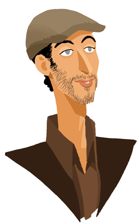
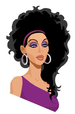
 Congratulations to RAJA aka Sutan Amrull, American's next drag superstar!
I'm hoping to do a few more Drag Race portraits for the reunion show, and then...?


 And there you have it! Working on all this Drag Race art has been an incredible experience on a number of levels-- it's been thrilling to keep pushing my abilities further while earning such a great response from other fans. I hope this little write-up of my process has been informative and maybe even a tiny bit inspirational.



 Over the past few months, I've had an amazing time experimenting with color and a "vector" art style in my

 I just updated my webcomic
  Another week, another batch of Drag Race drawings! This time, I chose Raja and Manila Luzon. I'm still having a blast playing around with this new style (and of course, such delightful subjects!) though I only wish I could include more of the queens each week...


