COLORING WITH QUEENS -- The Winners!
Okay, I have to come clean about something: I hate art contests. I hate the idea that art can be objectively judged or ranked. It's ridiculous.
However, one of my very favorite things about the internet is the sense of community and collaboration that can emerge from creative people with common interests. I see it as kind of magical: that I can post some simple drawings of drag queens and watch people transform them into CRAZY AMAZING MASTERPIECES. That was my hope for this contest, and all of you absolutely exceeded all my expectations!
And so I am choosing a small selection of the pieces that totally floored me. These are the ones that I found the most irreverent, or inventive, or inspiring. But I loved ALL of the entries, and I'm SO APPRECIATIVE to everyone who participated! If you don't see your work below, please don't feel bad, and certainly don't be jealous--all the prizes I'm sending out are extremely ridiculous, tacky, and entirely worthless. (I'm going to keep the prize packages secret until the recipients get them, because I don't want to ruin any surprises.)
HONORABLE MENTIONS
I wanted to give special shout-outs to a handful of contributors -- I won't be able to send out prizes to them, but hopefully they'll be sufficiently rewarded by the fame and glory that will inevitably result from their exposure here.
FIRST UP! Honorable Mention for: SHE KNOWS WHAT'S GOING ON
The Fab Hattersknow what's going on! I LOVED this rendering of Ru (so many Easter eggs, can you find them all?) My ABSOLUTE favorite element of this masterful collage is the imagery used for Ru's skin tone. I hope you ain't allergic, because it's PEANUT-PEANUT-PEANUT BUTTER! The Fab Hatters also sent in this DELICIOUS collage of Kim Chi, utilizing food from (mostly) Korean cuisine:

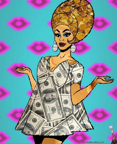
Next up, two Honorable Mentions for: GIMME THE DOUGH!

Eric Ginsberg molded this masterpiece!

And I have NO IDEA how Lucas Eller created this, but I am all kinds of impressed.
Honorable Mention for: FEELING VERY POINTED RIGHT NOW

Anthony Zero sent in this glorious depiction of Acid Betty looking her most terrifying. Just imagine the papercuts!
Two Honorable Mentions for: QUEENS OF COLLAGE

I adore this depiction of Thorgy by Pop it on Studio -- the collaged textures give it so much energy! My favorite touch: yak hair.
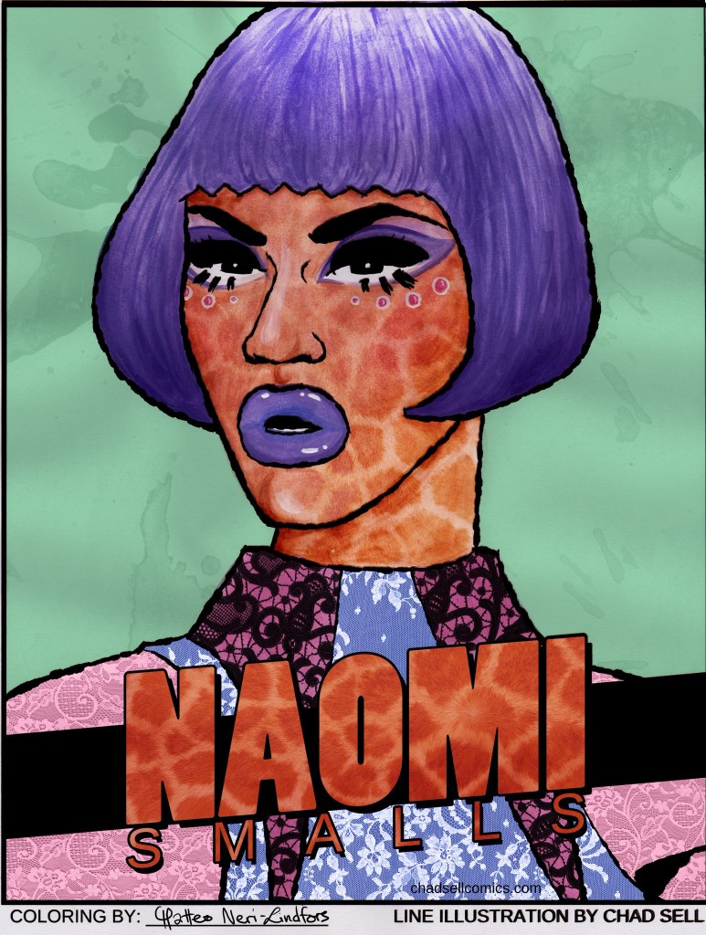
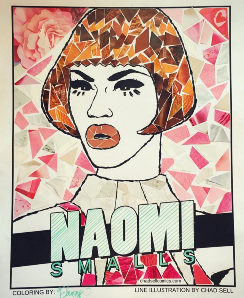
Matteo Neri-Lindfors sent in a number of cleverly collaged queens. My favorite was his depiction of Naomi -- since she's so tall and leggy, he gave her giraffe skin.
Honorable Mention for: FACE PAINTING
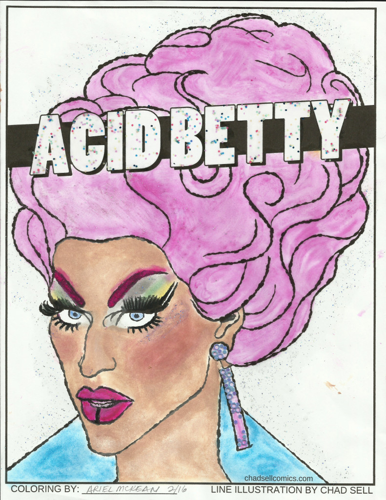
Ariel painted this lovely (and surprisingly naturalistic) rendering of Acid Betty using only makeup!
Honorable Mention for: TOURING THE UNCANNY VALLEY


Jean Pierre utilized some outrageous photo-bending skills to shape the queens' publicity photos into the configurations of my drawings! It is unnerving and crazy impressive.
Honorable Mention for: LUSCIOUSNESS


Johnny Morphine shared a TON of gorgeous work with some of the absolutely most luscious shading I've ever seen.
Honorable Mention for: BITCH DOESN'T SLEEP

Bryttany sent in SEVEN gorgeously rendered submissions. I love the clever combination of traditional coloring with digital background and typography!
THE TOP TEN (OR TWELVE OR WHATEVER)
Can you tell that I had a REALLY hard time picking just a few favorites? These top picks will each get a special little something from me in the mail. Here they are, in no particular order:

Caesar Turbuck's entry had me gagging on the floor. He essentially redrew the original line drawing and gave it this eerie and amazing simplicity. I LOVE the flat fields of color, and the greenish palette just feels right.

I told Lisa that her rendering of Robbie totally improved upon the original drawing. The tiny details beautifully suggest Robbie's distinctive features, and the linework masterfully evokes the classic Pop aesthetic.

Casi Maggio Kristant also employed a Lichtenstein-ian style with jaw-dropping effects. I LIVE for the vibrant use of the halftone dots, not to mention the PERFECT reproduction of the "Pop" graphic in Ru's bow, the sickening leopard spots, and the hair's linework.

Michael Walters (@DameEdnaShow) also used some gorgeous halftone patterning to give both a pop sensibility and a very subtle sense of shading to his piece. The palette is simple, but striking, and that yellow is such a lovely accent!

Hannah Stanwayshared this entirely gorgeous digital painting of Thorgy. Something about the contouring is so tactile and sculptural -- I was immediately struck by this piece.
Next up, two renditions of Acid Betty that are both eerily similar, but hauntingly beautiful:

Melina Varela created a shimmering and smooth illustration that feels so real you can taste that Acid on your tongue!

Meanwhile, @deadandfab used a fascinating pointillist style that's both a little trippy and utterly convincing.

I love how warm and organic Justin Averill's depiction of Kim is. He used some incredibly subtle texturing and a limited color palette to really set himself apart!

Brittney Elizabeth's rendering of Thorgy is such a delight! I love the playful colors, the glasses, and those freckles! It's all so fun and unexpected and THORGY.

I'm in love with @pearlliaison's minimal color palette and glitchy textures. Absolutely perfect for Acid Betty!

Megan Lara is a SICKENINGLY talented illustrator, and I was so thrilled to see her depiction of Kim! The colors are so, so soft and buttery and blissful. Go check out Megan's other work, and you will literally make yourself sick with envy at her skills.

I love the sumptuous and surreal feel of this piece by Jonna Suuntala. Seriously, just the deepest, dreamiest eyes of any piece in this contest. Just... wow.


I loved these two pieces from Edgar Fierce. He brought such a playful and bold style to both of them! I love that the textures and color choices are just a little jarring, giving them an energy and unexpected vibrancy.
THE FINAL FOUR
Ha! Did you think I was done? No, there are FOUR MORE favorites that stood out for being especially inventive and outrageous. These four artists will receive my DUMB DRAG GRAB BAGS full of weird, glittery crap!
So, in no particular order...
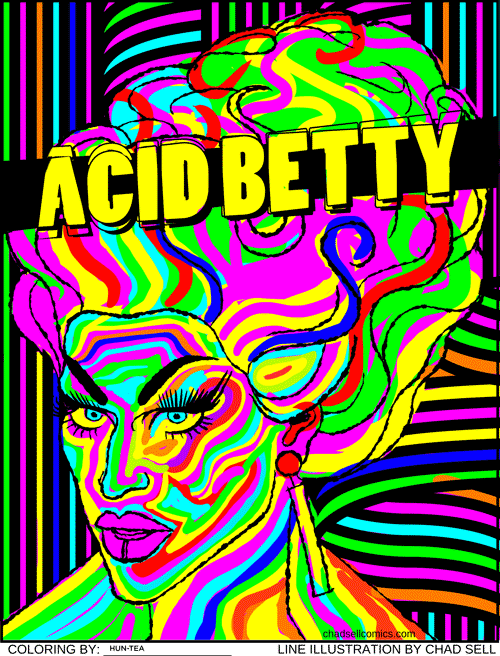
Don't stare at it too long! Is it too late? Can you even read this right now? I LOVE hun-tea's contribution (from reddit). Is it weird and horrifying and headache-inducing? Absolutely. But it's so perfect.


Elena Corona's collages (@lenalouwho on Instagram) are so meticulous and masterful. The color choices, the shapes, the perfect use of the blank paper -- I found these pieces to be so distinctive from everything else in the contest. Now I want to see them in person!

I cannot BELIEVE how gorgeous this piece by Tom Christophersen is! The shading of Bob's cheekbones conveys such a complexity of form and color-- Tom's skills with colored pencils astound me. The piece has an almost sculptural feel to me, there's such a solidity and a sheen to it! Every time I look at it, I discover something new to marvel over. Plus, GLITTER!
And finally, there's this BEAUTIFUL (and electrifying) animation of Dax!
(Unfortunately, because of my move to Squarespace, I don't have an easy way of sharing this video!)
I don't know what unholy magic Lazaro used to create this, but he clearly wields magnificent power. It is just. so. beautiful.
Thanks again for sending in your art, for sharing your favorites, and just sharing in my excitement about all these amazing pieces! You can find all the original "coloring book" drawings here -- although the contest may be over, you can still download them and share your creations!