Rupaul's Drag Race: Season 4, Episode 7

(Chad's note: due to some technical difficulties, the images in this post won't appear correctly. Sorry!)

So, this episode didn't have any balls-out, heart-wrenching emotional highpoints, but it was fun and buoyant and a total delight. The theme of the week? READING and WRITING, honeys.

The mini-challenge teaches that reading is fundamental, a phrase and practice made famous in the unforgettable documentary Paris is Burning. Yes, it's an amazing old film about drag queens, and yes, it is legitimately known as one of the greatest documentary films ever made. Seriously, I can't stress this enough: If you like ANYTHING about Rupaul's Drag Race, you must go get Paris is Burning from Netflix, your library, the decaying husk of Blockbuster--whatever. Here is just a taste.

The actual Reading mini-challenge this week is entertaining, but not terribly impressive, compared to past seasons. Of course, Latrice and Chad are the funniest. And Phi Phi's venomous jabs are just awkward.

K, now on to WRITING. When I saw the previews for this episode, I was skeptical. "A magazine challenge? They're reeeeeally desperate for ideas, aren't they?" But I was wrong--seeing the smart queens get a chance to shine was an utter delight.

Sharon's photoshoot for her magazine Kitty Cat? IT. WAS. CLASSIC.

[singlepic id=135 w=500 h=400 float=center]

She walks in, notices the outrageously studly photographer, and breaks the ice with “Have you done porn? You should really consider it.” And then she climbs a kitty stand. Seriously. When the producers shoo her off the teetering structure, her response was droll and fabulous: “You don’t know anything about fashion.”

And just to properly enrich all of your minds, I must point out that Sharon's kooky "crazy cat lady" costume was referencing another classic documentary, the amazing Grey Gardens. It's less gay, but just as wild. Take a look. The film depicts an eccentric mother and daughter, Big Edie and Little Edie, who hide away in a dilapidated old mansion, fighting, and singing, and dancing. (I can't help but mention that I named my own crazy, reclusive cat Edie after them.)

[singlepic id=129 w=400 h=500 float=center]

Chad Michaels rocked an edgy, zebra-print outfit for his photoshoot. That queen can seriously handle her animal prints, right? And you know I can't resist drawing a pretty pattern.

Willam's photoshoot was pretty fabulous, too. This week, she was really rubbing me the right way--maybe I've just gotten used to her humor, but I found myself enjoying her barbs more often than not. Seriously, I thought she might win this one!

But Phi Phi deserved it--after weeks of complaints, she finally lightened up her makeup, and she had never looked better! And I appreciated her sordid, gay approach to a travel magazine.

Jiggly's photoshoot was just priceless. That jumping rope segment was just... we're talking comedy gold, people.

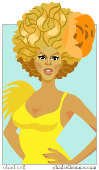
Once again, I totally missed the week's runway theme, not that it ever seems to matter. But there were some really good looks, and I was compelled to finally do a proper portrait of Willam:

[singlepic id=136 w=400 h=500 float=center]

I thought Latrice looked fabulous, but I understood some of the judge's criticisms. Still, I wanted to draw the lovely sheen of her dress, and as I kept pushing the colors, my portrait of her made her look like The Queen Who Was On Fire. But it suits her, since she was a Goddess of the Sea last week.

[singlepic id=131 w=500 h=600 float=center]

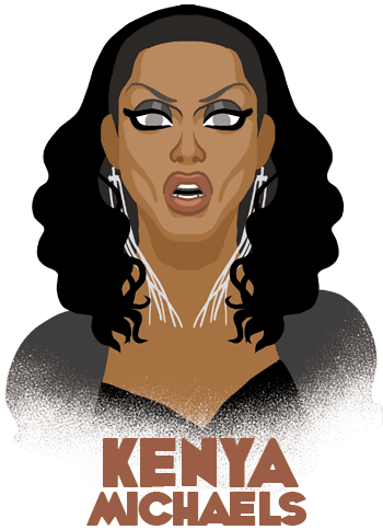
Chad Michael's looked amazing, as always. My only regret is that I didn't figure out a way to frame this to fit in her fabulous boots.

[singlepic id=130 w=400 h=500 float=center]

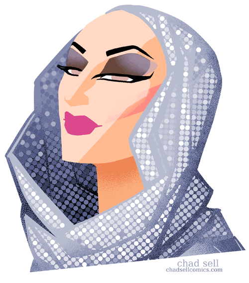
And of course, Sharon:

[singlepic id=132 w=500 h=700 float=center]

I admit, I went a little crazy with this one. But I told you--I'm a sucker for pretty patterns!

All in all, a great episode. Seriously, I wore myself out trying to capture all these fierce bitches.

Remember to check out my new PRINT SHOP, where I'm selling all my prints of Sharon, Chad, and Latrice! (as well as my best illustrations from last season!)

And my last few notes:

If you don't watch Untucked, you're really missing out. This week, we got Sharon's explanation for Willam's five o'clock shadow--apparently, it results from Willam's reluctance to use the same heavy pancake makeup the other queens do.

Also, Sharon cops to farting on the runway, which is most notable for Rupaul's flustered non-reaction.

Finally, Logo has included some deleted scenes from the Dragazine challenge, and Chad Michaels' one is DIVINE! 


Rupaul's Drag Race: Season 4, Episode 6

(Chad's note: due to some technical difficulties, the images in this post won't appear correctly. Sorry!)

Wait, seriously? I can't believe we've already gotten to the sixth episode! Sheesh! But it was quite an episode, right? It's interesting--we had a Latrice episode, then a Chad episode, and now Willam. And he deserves it, right? I can't think of any other Drag Race contestant who's proven so enigmatic, eliciting such confusion and bafflement. (We've got a lot of queens going by male names this season, so I can't help but refer to them as male, forgive me)

The wet T shirt contest was an interesting challenge, getting the queens to put it all out there. Despite some of the queen's reticence (most notably Sharon's), the queens pulled it off with aplomb. (Well, except for Phi Phi, which was kind of satisfying) I couldn't help but observe that the giant breastplates provided looked outrageous on all the queens, until we got to Latrice--given her size, they actually seemed pretty modestly proportioned to her. I only mean that in the best way, though, and the fact that she pulled all of that off with her highly absorbent padding just shows what a pro she is.

[singlepic id=119 w=500 h=500 float=center]

(Click this and the other images for even bigger, more fabulous versions)

The main challenge of this episode? It seemed very odd to me, especially given how confused I was from the start: A parade float, based on a color of the rainbow flag, relating to pride, but also fashion forward? That just seemed like a jumble of elements, especially because I didn't understand who would be wearing the floats, and in what venue. (I had hoped the Pit Crew would model the floats, which was perhaps just wishful thinking) But the fact that they designated each queen's color theme by handing out colored handkerchiefs was HILAAAARIOUS! If you're not well versed in gay history, colored hankies pre-dated Grindr and Manhunt, but did largely the same thing--if you had a certain color dangling out of a certain pants pocket, it sent a coded message about what you were looking for to others in the know. Clearly, I'm vague on the specifics, but that's solely because I'm not single. Otherwise I'd be googling the fuck out of those color coded handkerchiefs!

Anyhow, it was lovely to see Chad, Sharon, and Willam discuss some queer history with the other queens. And Chad was certainly lovely this week, clearly embracing the oversized spirit of the challenge:

[singlepic id=118 w=500 h=600 float=center]

I loved Chad's showgirl look, particularly his "cougar" stripes.

Also, how adorable was that runway backdrop of greased-up manflesh, waving back and forth in sailor outfits? Good to see the Drag Race production budget put to good use! *Sigh* okay, gotta cool off.

Willam used his float really playfully, which totally worked. And yeah, he looked fabulous. But my problem with his runway outfits is that I'd much prefer some gaudy, outrageous accessories made in someone's basement than all the designer shit he so proudly trots out. I'm just never compelled to draw him. But did he deserve to win? Yeah, probably.

[singlepic id=121 w=500 h=600 float=center]

Still, Sharon was a lot of fun. Her giant snake was fierce and I knew it would be fun to draw. Oh, wait.

I thought Phi Phi and Milan used their floats really well, too. Jiggly didn't. Her giant orange merkin didn't help, either.

I was crushed to see Milan lip sync a third consecutive time, since I think she's fabulous. Her stripping down could be seen as a tired Drag Race gimmick, but given the spirit of Born This Way, I thought it was fitting. And he looked really cute, so that's how I drew him.

[singlepic id=120 w=500 h=500 float=center]

I think Milan is a fabulous performer, and a gentle soul. He had a rough time on the Drag Race, but I'm glad he had the opportunity to strut his stuff! Even... three times in a row.


Sharon Needles' Beaver

Okay, okay, I couldn't resist drawing Sharon Needles in her ridiculous beaver outfit. This animation is only intended as a silly little thing--Sharon is clearly one of my absolute favorite queens of this season, and I think she handled this week's challenge really well. I love the old school squeaky "dumb blonde" voice she used, and the cartoonish make-up!

It's probably pretty obvious that I am not trained in animation--these animated gifs are just fun little things I put together in Photoshop. But I'm having fun, so there will probably be more.

In the meantime, be sure to check out my other Drag Race art!

Rupaul's Drag Race: Season 4, Episode 4

Wow, what an episode! Despite all the fighting and the drama (which was pretty great, itself), lets all come together and dance like maniacs while Latrice Royale "takes us to church," singing "Jesus is a Biscuit." Holy. It was really Latrice's episode to shine, and she deserved it. Did everyone love her performance as Marge, the prison guard, as much as me? There were too many great  lines from the challenge, but my favorite was when Latrice told us: "I was tapping into some serious acting talent, because Marge doesn't like nuts, but Latrice does."

Large Marge
Large Marge

What a glorious queen, right? And no, I didn't even come close to capturing the magnificence of Latrice.

Seeing Sharon in her beaver outfit was pretty great, too--I especially loved her squeaky voice and cartoonish make-up. I was very tempted to draw her that way, but opted for her catwalk look, instead.

Sharon
Sharon

This season, most of the catwalk themes seem like an afterthought--to both the producers and most of the queens. But Sharon came out full of old school sitcom energy, channeling Carol Burnett as a vampire lord.I liked a lot of the runway looks this week, and it was hard choosing just a few to draw. Ultimately, I picked the ones I thought would be the most fun to depict--predictably enough, I love big, geometric shapes, feathers, and shiny things!

Runway looks
Runway looks
Chad
Chad

I also loved Chad Michaels' look, but only had the time to do this quick little doodle:  Chad is such a great queen, talented performer, and gracious human being. I hope he starts getting more screen time as the season progresses!

I was very, very sad to see Madame La Queer go, but at least we were treated to a pretty amazing "lip sync for your life" that none of us will soon forget.

Seriously, Milan? Those moves were crazy. Like, I don't even... I can't...

I was delighted and astonished and a little baffled.

Perhaps Willam put it best when he described Milan's show-stopping, stage-crossing slide this way:

Milan
Milan

"He swiffered the floor with his taint."

What, and next week is The Snatch Game?

Bring it.

The CLOCKIES

I'm excited to share some wild illustrations I did for local author David Erik Nelson's Kindle novella TUCKER TEACHES THE CLOCKIES TO COPULATE. It's a funny, profane, thoughtful tale set in an alternate version of post-Civil War America, where steam-powered automatons fought as soldiers, and are now adrift amidst Reconstruction. I can't recommend this book enough--it's exactly the mix of humor, wry observation, and imaginative magic that I love. So go buy it!


30 QUEENS: My new collection of DRAG RACE art!

So! I've finally collected my Drag Race art into a nifty little art book! It features 30 queens (more or less), is 5.5" x 7", and is available to buy online!

Each copy is $10 plus $2 shipping in the US. Orders for 30 QUEENS and Shadow Play can be combined for a flat shipping rate of $2. Shipping of 30 QUEENS is free with any purchase of my Drag Race prints!

 [add_to_cart item="101" quantity="user:1" ] 

 E-mail me if you have any questions!

panjacomics at gmail.com


Meeting Raja

[slideshow id=5] So, I was lucky enough to meet my drag superstar muse, RAJA (aka Sutan Amrull) when she performed in Detroit!

It was an absolute thrill to finally give her a hug and hang out--she proved to be every bit as cool, down-to-earth, and smart as I'd expected. 

In honor of the event, I made this illustration, depicting her look from the Detroit show--she's gone blond and was sporting some amazing, glittery jewelry!

Thank you, Sutan, for such an amazing night!

Doodlin'

So, I haven't been updating The Sellout much, and I feel bad about that. I've been having a blast with Manta-Man, and so most of my time has been focused on that. Plus, I've been busy with some other projects that aren't quite ready to present to the world, and I went to the Summit City Comic Con, hung out with friends at the Kids Read Comics Convention, etc. In any case, I wanted to share some ninja doodles I made today--I'm still trying to develop the right style for my self-contained Sachiko spin-off story. My tendency is to obsess over page layouts, anatomy, and clean lines. To mix things up, I'm playing around with different approaches that lead to much looser, lively results.

More soon!

Manila prints now available!

THIS IS AN OUTDATED VERSION OF MY ONLINE STORE--PLEASE CLICK HERE TO SEE MY PRINTS OF SEASONS 3 AND 4 OF RUPAUL'S DRAG RACE I'm glad to finally offer my prints of Manila Luzon for sale!

Each 11″ x 14″ poster is available on either glossy or matte paper–the glossy paper is thicker and looks more like a slick poster, whereas the matte pieces look almost like silkscreen prints.

Prints are $5 each, shipping is $5 within the US (for orders of up to 15 prints) and $7 for Drag Race fans in Canada. (Sorry, shipping elsewhere has proven to be too expensive!)

And, of course, you can combine orders of Manila, Raja, and Delta Work.

Click the images below to see what each print will look like (with the exception of slight changes in color that result from the printing process.)

I’m happy to sign the posters, if you want– just mention it when you check out!

When you’re ready to check out, click here:

.

[singlepic id=59 w=320 h=240 float=left]

. .

Choose Matte/Gloss Paper
 

.

.

.

. .

.

[singlepic id=55 w=320 h=240 float=left]

.

.

Choose Matte/Gloss Paper
 

.

.

.

.

.

[singlepic id=54 w=320 h=240 float=left]

.

.


Choose Matte/Gloss Paper
 

. . . . .

[singlepic id=52 w=320 h=240 float=left]

.

.

Choose Matte/Gloss Paper
 

. . . . .

.

[singlepic id=57 w=320 h=240 float=left]

.

.


Choose Matte/Gloss Paper
 

. . . . .

[singlepic id=56 w=320 h=240 float=left]

.

.


Choose Matte/Gloss Paper
 

. . . . .

[singlepic id=58 w=320 h=240 float=left]

.

.


Choose Matte/Gloss Paper
 

. . . . .

[singlepic id=51 w=320 h=240 float=left]

.

.


Choose Matte/Gloss Paper
 

. . . . .

[singlepic id=53 w=320 h=240 float=left]

.

.


Choose Matte/Gloss Paper
 

. .

.

. Again, I'm happy to combine your orders of Manila with prints of Raja, and Delta Work.

When you're all done shopping, click below! .

The Sachiko Spin-off!

I've been referencing it for a while now, but I'm excited to officially announce that I'll be doing a self-contained story featuring Sachiko (from my webcomic Manta-Man) in a creepy, supernatural tale of desire and destruction. I'm hoping to have it complete within a few months, possibly in time for some of the comic conventions at which I'll be exhibiting. The idea had been germinating ever since I ran across Obakemono, a delightful site collecting illustrations and descriptions of mythical Japanese creatures. I was immediately drawn to some of the eerie folktales, and it seemed perfectly natural to incorporate them into Sachiko's ninja world. My new comic story will feature my own spin on one of these stories--given my inclinations, you can guess in what directions I'll be taking it.

The story will also give me the chance to experiment inking with a brush and brushpen--in fact, while sketching out some of my ideas today, I was so taken by my early results that I wanted to share some spoiler-free glimpses here:


The Pit Crew

What better way is there of celebrating this season of Rupaul's Drag Race than by illustrating the talented men of the Pit Crew? Seriously, we didn't see nearly enough of them (and I mean that in the sense that they both clearly have a lot of personality and have a lot to offer! sheesh!). In case you didn't already know, Shawn Morales is on the left, Jason J. Carter is on the right.

I had been putting off this illustration for a while, because I wasn't sure how my "Drag Race" style would translate to a depiction of studly men, but I was surprised at these results! Here are some slightly more tasteful excerpts:


(Wait, I didn't mean for them to be looking meaningfully at each other. I shouldn't post anything after a beer.)


.

Too far? Judge for yourself.

So, yeah, as if weeks of Drag Race portraits weren't enough, I decided to draw my two favorite judges from the show--aside from Rupaul, of course. (My portraits of her are on their way, don't worry) Santino Rice: When did he get so cute?

And Michelle Visage: Sorry Raja, but she should've been America's Next Drag Superstar! (I mean that in only the best way, Michelle!)

Stay tuned for my Rupaul portrait(s), the Pit Crew, and the reunion show!

How to Draw a Drag Queen

Some Drag Race fans have been asking about the process of creating my fan art, so I wanted to share some of the steps in creating my "Money" look for Raja, even though my methods continue to evolve.

It all starts while watching Rupaul’s Drag Race every Monday night--as the girls start coming out onto the catwalk, I grab my sketchbook and start laying out loose, gestural poses and ideas.

You can see from these samples how rough and simple this process is--I've found it's better to work out ideas with quick sketches while figuring out your plan, rather than investing too much energy in the first drawing you come up with.

(Aaaand since I don’t have a DVR to pause the show, I have to work quickly to keep up!)

My favorite catwalk looks tend to be the most striking and distinctive ones, which is why I've drawn Raja each and every week-- her frequent use of varied cultural and historical fashions conjure up a slew of associations and ideas for me to work with. In this case, I saw Raja as the star of a lavish 1930’s musical.

I decided to go further with this drawing. Although I (clearly!) still needed to work a lot of stuff out, I liked the angle of Raja’s head, her hat, her torso, and her arms.

At this point, I scan in my sketch, move things around, then print it out a little larger. For this part of the process, I use a lightbox-- a fresh piece of paper is placed on top of the print-out, and the light shining through both layers of paper allows me to derive a more refined sketch from that chaotic first drawing. You'll see I also changed the position of both her arms and her legs.

During the lightboxing process, I frequently flip over the drawing and look at its mirror image, which allows you to see the weird assymmetries in your work--it's a horrifying (but essential) trick if you want to fix the strange distortions that would otherwise go overlooked.

Once the new drawing is done, I scan that, too. You’ll notice the use of both blue and black pencil--the blue is for the sketching process, where I'm still trying out different ideas. Then, in Photoshop, it’s easy to knock out those blue tones, so you’re left with a cleaner image.

At this point, I kept switching things around, subtly changing the pose and blocking in some rough colors to get a better idea of the final piece.

At the last minute, I decided to bend Raja's leg up and loosely sketched it in with my graphics tablet. I was starting to get worried that the pose looked too unrealistic and weird, which is often the case. One of the tricky things about the Drag Race portraits is determining when my simplification and exaggeration of the figure looks good, and when it just looks f*&ked.

Back to the lightbox! Here, I do the final drawing in both blue and black ink. The reasons for that get kind of complicated, so click here to go to my "technical addendum" if you want to find out more about some of the more elaborate Photoshop tricks I use.

With my earlier Drag Race art, I would literally just draw each shape with a polygonal "lasso" tool in Photoshop, though I switched my process about halfway through the season. Now I'm able to use this final drawing to serve as a guide in which Photoshop is able to assign different blocks of color to each section, according to my specifications. Depending on the complexity of the drawing, it can take a while to go through and individually designate all the colors that will go into the final piece.

It's a tedious process, but it's exciting to see the portrait start taking shape. And once that’s done, I begin fussing over everything else--where to throw in some texture, tweak the face, fix things that aren’t the right size or are at the wrong angle.

This is the first Drag Race portrait where I finally let myself use line-- for my previous pieces, I had always forced myself to use flat shapes of color (with added textures and shading for some, of course) but I wanted to try incorporating a little bit of line while keeping to the style I've developed over the course of these past few months. I tend to rely too much on linework in my other art projects, and one of my favorite aspects of this Drag Race illustration series has been that it's rejuvenated my love of, and confidence in working with, COLOR.

For better or worse, I only settle on the final layout at the end of the night, as I'm starting to go crazy from spending too many hours at the computer. I played around with a few different ways of framing Raja and finally came up with the giant burst  of yellow to use as the background.

RajaAnd there you have it! Working on all this Drag Race art has been an incredible experience on a number of levels-- it's been thrilling to keep pushing my abilities further while earning such a great response from other fans. I hope this little write-up of my process has been informative and maybe even a tiny bit inspirational.

Again, check out my "technical addendum" for more specific Photoshop techniques I used in making this portrait!

Please send along any questions you might have!